Saturday, July 30, 2011

What about coloring books for kids?

Like so many other kids, I grew up with coloring books. I did love them. It was my first venture into art! I still have a healthy collection of Dover coloring books (http://store.doverpublications.com/) on my shelves to use as reference of historic scenes and certain natural subjects (like hawks, for example.)

The best coloring book artists do a wonderful job producing very clean and easy-to-read line drawings. There’s a great deal of technical skill in those drawings and I have always admired them. So much so that I have decided to create my own line of e-coloring books for kids. The first one will be called “My Day At the Horse Show.” I hope to have some hard-copy prototypes ready to present at one of the largest Hunter-Jumper horse shows in the area next month.

I'm quite excited about using an e-book format for coloring books. Not only will it be economical to produce but it'll also be a great way for parents to get multiple uses out of each page. Mistake…? More than one child? No problem! Just print out another page! ;-)

Here is a detail from one of my images. What do you think?

Image copyright Sara Light-Waller, 2011


Thursday, July 28, 2011

Step-by-Step Inktense/Neocolor II Painting: “Chickadee”

One of my readers asked me to do a more in-depth description of the process I used to create my latest painting "Chickadee" in Inktense pencils and Neocolor II crayons. I hope that by sharing my process here I will encourage others to try out this fun technique too!

Picking tools
I have been fascinated by Inktense pencils since I first heard about them. I have been most pleased to see how well these ink pencils integrate seamlessly into ink artwork. Unfortunately, some of the Inktense colors aren’t very lightfast and to avoid fading I decided to choose the colors for my piece based on lightfastness ratings of 6 and above (on a scale of 1-8, 8 being the most lightfast.)

I have been taking an interest in water-soluble pencils and crayons recently and was curious to try using the Caran D’ache Neocolor II crayons in a fine art piece.

On one of my trips to Dick Blick's a while ago I picked up a small piece (8” x 8”) of Aquabord to experiment with. I liked the idea of using it here as the surface is rather rough and I thought it would work well to show the roughness of the tree bark in my picture.

Picking a palette
In starting a new piece my first step is always to choose a palette. Although I may add additional colors later on, I think it's best to do some planning before you start. Flying blind with color can lead to some awkward color passages and disharmonies later on.

I use hole-punched pieces of white watercolor paper (nice and heavy) to match little pieces of color in my reference photo with the Inktense and Neocolor II swatches in my swatch book.

Once the palette is chosen I'm ready to start the piece. Here is a look at my workspace with palette swatches, brushes, a sponge, and q-tips for applying and softening color, pencil sharpener, Inktense pencils (in cup), mechanical pencil, and some of my Neocolor II crayons laid out and ready to go.

Here is the reference photo I chose to work with in this piece.
I used graphite transfer paper to transfer the basic image shapes to the Aquabord.

The Painting
To begin the painting I laid down color with Inktense pencils to create the out-of-focus background. After applying the color I smoothed it with q-tips wet with a moderate amount of water. The Inktense pencils create very bright colors that will be enhanced and softened by Neocolor crayons later on.

Here is the Chickadee with Neocolor II crayons added over the Inktense pencils in the background. Fairly opaque in nature, they helped create more variation and richness to the background as a whole. At this stage the background is nearly complete.

Next I began working on the darkest darks in the tree branches in the middle ground with Inktense pencils. I have also colored the bird’s eye for tonal reference. The eye will remain the darkest dark in the entire piece.

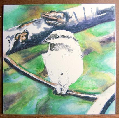
I have developed the branches a bit farther here and added a tiny bit of work on the bird itself. At this stage the colors you see in the middle and foreground are still in Inktense only. I have not yet started adding the Neocolor crayons to the branches.

Here we see the main branch completed after adding several layers of Neocolor II crayons. I have also started adding Neocolor to the other branches.

With more detail (Neocolor II) added to the other two major branches and a bit of color (Inktense) added to the bird, the painting is beginning to come together.

The piece is almost done now. Just the final details and some smoothing of the color is left to do. At this stage I like to leave the piece for a few days so that I can contemplate what still needs to be done after a break. Sometimes, I’ll turn the painting upside-down and look at it next to the reference photo (also upside-down) to see if the shapes and colors are matching well. Turning a piece upside-down can help remove your ego from your thought process and simply analyze the shapes and colors for accuracy.

Chickadee 8" x  8"
Neocolor II crayons and Inktense pencils on Aquabord
Well, here it is! The finished Chickadee painting. I am most pleased by how this new medium worked out for me. It was satisfying in both a tactile and a visual way. High marks for enjoyment!

Here are some close-up images from the painting: 

Close-up of the main branch

Close-up of the bird
I hope that this tutorial has been helpful and even inspiring. Creating this painting has certainly been the most fun I’ve had using crayons since the second grade! Why not try this technique yourself? If you do, I'd love to hear from you. And don't forget to send me a link too so I can see what you've created! If you liked seeing my step-by-step process here please let me know and I'll post more how-to's in this style in the future. :-)

Friday, July 22, 2011

Who says a crayon can't be used to create art? Chickadee finale

Chickadee 8"x 8"
Neocolor II crayons and Inktense pencils on Aquabord
Well, here it is! The Chickadee painting. I am most pleased by how this new medium worked out for me. It was satisfying in both a tactile and a visual way. High marks for enjoyment! I am looking forward to trying some other subjects in this style. I have a really good feeling about it. :-)

Here is the entire sequence of the piece from start to finish.

Cheers!

Thursday, July 21, 2011

Wednesday, July 20, 2011

Chickadee Part 5


With more detail (Neocolor II) added to the other two major branches and a bit of color (Inktense) added to the bird, the painting is beginning to come together. I am really enjoying the play of Neocolor II crayons on the rough texture of the Aquabord. Together, they create a really nice, textural, harmony. :-)

Monday, July 18, 2011

Chickadee Part 4


The main branch is now looking much more complete after adding several layers of Neocolor II crayons. The Neocolor crayons are really lovely to work with, very tactile as only crayons (or maybe oil pastels) can be. For me this makes the layering process quite enjoyable!

Now to get working on the bird herself... ;-)

Friday, July 15, 2011

Chickadee Part 3

Here is the chickadee today with more development on the branches and a tiny bit of work on the bird itself. At this stage the colors you see in the middle and foreground are still the Inktense base. I have not yet started adding the Neocolor crayons. I will deliberately leave the bird's eye in Inktense only as I like the shininess of it.

Thursday, July 14, 2011

Chickadee Part 2


Here is the Chickadee with the background mostly completed. Since the last update, I've added Neocolor II crayons over the Inktense pencils in the background. This created more variation in color and a bit more richness to background as a whole.

At this point, I have just started working on the tree branches in the middle ground with Inktense pencils.

Wednesday, July 13, 2011

Yes, you can use q-tips and crayons for fine art! Chickadee Painting

I have recently started a new piece in Inktense pencils and Caran D’ache Neocolor II water-soluble crayons. What a delight! I took my cue from Mona Majorowicz and her Squidoo lenses about using Inktense with Neocolor II crayons in her wonderful animal paintings.

I simply had to give it a try! Although Mona frequently uses Suede Board as the support for her paintings, I decided to use Aquabord for my test piece. The Aquabord surface is quite rough and I felt this would be appropriate for the woody subject I had chosen.


In starting the piece the first step was to choose my palette. I used hole-punched pieces of white watercolor paper (nice and heavy) to match little pieces of color in my reference photo with the Inktense and Neocolor II swatches in my swatch book.


After choosing my palette, next I assembled my tools. Here is a picture of all the pieces laid out. And yes, those are q-tips. I quickly discovered that they were the best choice to smooth the Neocolor II crayons. Brushes work too but dilute the effect of the opaque crayons. On the rough surface, the crayons have been giving me really wonderful textural effects.


Here is stage one of the painting with the background laid in, mostly in Inktense pencils. The brightness of the Inktense provided a wonderful base for the Neocolor II crayons.

Please come by again and watch how the painting progresses. :-)

Saturday, July 9, 2011

Fun Recycled Crayons!

Last weekend, I went to the Saturday Farmer’s Market in local Redmond, WA. As I wandered, I found myself thinking about an upcoming project (creating a series of themed coloring books.). While strolling, my eye caught on a sign that read, “recycled crayons.” I noticed a series of baskets filled with a plethora of bright shapes including ladybugs, motorcycles, and fish made from crayons.

I was drawn in like a magpie! I had a delightful conversation with the shop owner, Chelsea Johansen (of CheyLoCreations) and her mother and decided that I had to have one of the cute, vermillion ladybug crayons. The only problem is that I’m not sure I can bare the thought of disfiguring it by drawing with it! All the same, what a fun idea! If you'd like to pick up a few recycled crayons for yourself, Chelsea has an Etsy store, www.etsy.com/shop/cheylocreations, where you can see not only her recycled crayons, but also some of the her other wonderful products.

Chelsea tells me that she's at the Farmer's Market most every Saturday, so if you're in the area, do stop by and say "hi."


Recycled crayons with an undersea theme
My ladybug crayon 2"x 2"

Wednesday, July 6, 2011

Seven (7) Reasons Why Crayons Make Great Art Tools

"Pansies" 6.5cm  x 9cm, crayola crayons
  1. Most people like crayons and aren’t afraid to use them.
  2. They are really inexpensive – you can get a 120 count box for under $10.
  3. You can share them with your kids and color together.
  4. They create very rich colors.
  5. You can layer them, lay down flat color with them, or use pointillist techniques to create art that looks really good!
  6. Coloring outside the lines remains fun even when you’re grown up.
  7. They are non-toxic (but you still probably shouldn’t eat them!)

Tuesday, July 5, 2011

New sketch kit

Happy (US) Independence Day! I hope you all have had a good and safe holiday. We had a really nice day cruising around the area looking at homes for sale, baking cookies for a nice elderly couple next door and finally going to a wonderful party at a neighbor's home. :-)

This past weekend I decided to redo my current sketch kit. The old one just wasn't feeling quite right any more. Here’s my new configuration.

My new sketch kit - so far, I'm pretty happy with it.
I have added all new half pans to my old Winsor & Newton Cotman travel watercolor box and filled them with a new palette of Daniel Smith watercolors. Here are the colors I’ve chosen: Lemon Yellow, Cadmium Yellow Medium, Quinacridone Gold, French Ochre, Transparent Red Oxide, Transparent Pyrrol Orange, Quinacridone Coral, Cobalt Blue Violet, Cobalt Blue, French Ultramarine, Venetian Red, Sepia, Serpentine Genuine, and Payne’s Grey.

Also in my kit I have two Noodler’s Flex pens (one filled with Platinum Carbon Black and the other with Noodler’s Fox Red), two waterbrushes, a ruler, pencil, tiny eraser, and a tiny travel brush (that I may yet replace with a better folding brush.) Add to this some paper towels, a pencil case and my moleskin, and I’m ready to go.

Here are the first two sketches I made with this particular kit.


Another thing I’m working on right now is simplifying the pen work in my sketches to make more “room” for the color. I’m pretty happy with these first two attempts. Using simpler pen lines makes the entire drawing seem more peaceful and I like that. I'm looking forward to some sketching time this week for more "road testing." ;-)

Friday, July 1, 2011

The Fine Art Shop at Flying Pony Studios is now open for business!

For many years I have served the public as a massage therapist and a fine artist/illustrator. There is always a lot of pressure when one is in business for oneself. You always feel that you have something to prove to the world. This creates (at least for me) the feeling that you’re pushing against yourself and trying to force your will upon others. Some people don’t seem to mind this feeling of imposition but the truth is that you can never “get” anyone to buy your services or products. That is a false assumption. What is real is that the world is full of very creative and wonderful souls who desperately want to share with others what they have brought into this world with great care and joy.

I have met many of these folks on Facebook, Yahoo groups and other forums, and sites such as LinkedIn. I am astounded and grateful for the amazing creative souls that continue to pop up in my life every day.

As I was designing and setting up my new shop I realized that I had changed in a profound way. I no longer wished to try and “convince” anyone to buy my products and services. I no longer had anything left to prove. My desire is to share my work with the world. In doing so I hope that some people will find resonance with it and want to buy it. We as artists (or service providers) can hope for no more than that. Do you like my inner vision? We ask through our art. *smile* We can only hope that for some, the answer will be “Yes!”

Please come and share my visions. You can find the BRAND NEW Flying Pony Studios shop here. While you’re there, please take a moment to check out my home page where you can download some FREE clip art when you sign-up for my mailing list. In the future I will be adding more cards, fine art prints, clip art CD’s, and a line of kid’s coloring and paper doll books all based around a very cute, very fat, pony named Basil. My mailing list will keep you up-to-date on all my newest products and you’ll also get my newsletter which is packed with how-to art tips, free clip art give-a-ways, and other amazing things that I haven’t even thought of yet.

I hope you will stop by and take a walk through my new shop. It’s been a long time in coming!

Peace,

Sara

PS. Oh! There’s one more thing. Please let me know if you find ANYTHING that’s not working in the store so that I can fix it. After all, the paint is still wet on the walls. ;-)