Friday, July 30, 2010

Painting with a Limited Color Palette

Watercolor camel painted with a limited color palette
 As a continuation of my color experiments I decided to do a watercolor using a split complementary palette. I used my color cards to pick out colors I thought would best suit the subject matter, a stuffed East Indian camel that I have as part of a collection of similar animals. I chose four colors: Quinacridone Gold (yellow-orange), Buff Titanium (yellow), Serpentine Genuine (yellow-green), and Cobalt Blue Violet (blue-violet) for the complement.

I was happy with these color choices but because there was a lot of magenta in the original camel I decided to break my rule and add some Quinacridone Rose as well. Overall, I’m quite happy with the result, especially as I’m still getting my feet back under me in watercolor. However, I'm finding the addition of the Quin Rose a bit jarring to the overall color harmony. Perhaps next time I’ll fight the realism instinct and stick to mixes from my initially chosen colors. ;-)

Oh, and by the way, this piece is my Every Day Matters challenge # 31, draw something that you collect.

Wednesday, July 28, 2010

I don't really do calligraphy...

 ...but I pretend by drawing my letters. Sure it's cheap, but I've gotten to be a rather good copyist after all these years. Back in the day (before our lovely computer fonts) I remember copying (and cutting and pasting together by eye) all sorts of fonts. Especially Art Nouveau fonts. I used to love those!

Sketch Journal Page 7/28/10

Today I felt like practicing my letters and was inspired by some great calligraphers I saw on the web. That said here's my sketch journal page for today. I think I like this lettering style, it's interesting to look at. A winner in my book! *lol*

Tuesday, July 27, 2010

Everyday Matters Combined with Pen & Ink Exercises

I have noticed lately that my pen & ink skills have gotten a bit sloppy. It’s time to, once again, practice texturing exercises! While choosing the subject matter for these pieces I decided to make them “Everyday Matters” exercises as well. So here are my first two.

EDM #8: Draw your watch – using two texturing techniques: parallel lines & stippling.
 
EDM #119: Draw some rocks (well one rock anyway)– using contour lines. This one is stippled with watercolor.

It’s been fun starting to do the EDM exercises. As I have plenty more texturing exercises left to go, I’m looking forward to combining them with other EDM challenges. I just hope no one will be put off by the fact that I’m not doing them in numerical order. ;-)

Monday, July 26, 2010

Color Dots

I am a lucky girl! I live close to two Daniel Smith stores. The big one in Seattle is farther away now that I live on the “East Side” of Lake Washington, but the Bellevue store is mere 15 minutes away. A VERY great temptation for me. *silly grin*

Daniel Smith regularly gives away little watercolor paint dots on cards for free in their stores (also in the University Bookstore in Seattle for some reason) usually when they are promoting new colors. I’ve discovered quite a few new colors this way including Sicklerite Genuine (a lovely, granulating cocoa- brown) and Mayan Blue Genuine (a warm green-blue). The last time I was in the store they had a big bonanza card of 66 color dots for about $3. I couldn’t resist. It included quite a few colors I’d never tried and I was dying to see what they looked like. About a third of them were PrimaTek colors (expensive!) but this gave me a chance to see what they looked like. Big surprise I like several of them.

DS 66 Try-It Color Dot Sheet
 
Today I made up samples of each of the colors (some of which I already had) and decided which I liked best. It was a fun exercise.

Lovely color samples
A few notes on the colors. The pale ones on the bottom right are all Interference, Iridescent, and Duo-tone colors. The colors on the top of the right hand sheet are the new DS "Cadmium Hue" colors. They are Daniel Smith's new non-toxic Cadmium colors. They are really nice, clean colors. I suspect they'd make really nice, clean mixtures.
We have some winners!

Here are the colors I liked best:

PrimaTeks: Bloodstone Genuine, Blue Apatite Genuine, Green Apatite Genuine, Lapis Lazuli Genuine, Zoisite Genuine

Other colors: Quinacridone Fuchsia, Cadmium Yellow Light Hue, Cadmium Yellow Medium Hue, Cadmium Yellow Deep Hue

Of course, I won’t be buying all of these colors at once. But I put Zoisite Genuine and Cadmium Yellow Medium Hue on the top of the list for the next convenient holiday. :-)

Thursday, July 22, 2010

Color Cards: Dealing Myself a Whole New Hand

Watercolor Cards
When Vicky Williamson showed us her deck of  watercolor cards  in her blog I knew I needed to make a set for myself. I felt sure that they would be a wonderful way to keep track of my favorite paint colors. They would also be a great way to visualize painting palettes.

Each of my color cards has a bunch of written information on it (written very small as they’re ½ the size of conventional playing cards.) The information includes: name of color, color mixture, lightfastness, transparency, tube or stick, and classification for placement on the color wheel. (For example Y (Yellow), or YO (Yellow-Orange.))

I created the card set focusing on my Daniel Smith tube and watercolor stick colors. As I made up the cards I realized that the sticks not only travel well, but create very smooth washes, very easily. I filed that information away for later. I also learned that at least in one case I’d mis-categorized two similar colors.

Will the real Magenta please stand up?

Next I laid out the cards as closely as I could according to Bruce MacEvoy’s Artist’s Color Wheel. This wheel is organized by both color and chroma. Here I realized that I seem to like Red-Orange colors. Perhaps that’s a throwback to my years of painting bay horses and other russet-colored animals. *lol*  I don’t know, but either way, it showed me something I had not realized before.

Watercolor cards arranged into The Artist's Color Wheel.

The next step was to start playing with the cards to experiment with palette colors. Here is an example of using the cards to create three analogous color palettes with possible additional harmonious colors. I have used this method of color selection for the watercolor study I am currently painting and I am quite pleased with the result. When it’s finished, I’ll post it here and share. :-)

Analogous Color Palettes

I believe that this is just the beginning of the usefulness of these cards. Thanks to Vicky Williamson for the great idea. The cards are already helping me visualize my colors in a new and exciting ways. They’re leading me to fresh, expansive ideas in my painting. Isn't that just what creativity in art is all about?

Tuesday, July 20, 2010

Limiting your palette as a way of expanding your colors

Limiting your palette is great way to get to know your colors better. Creating paintings with very few, but harmonious colors, can make for lovely paintings and less mud.

Before I go on I feel like I should define a few terms, although I’m sure most everyone reading this will know these.
  • Complementary colors are defined as the colors directly across from each other on the color wheel. When you mix the three primary colors (Magenta, Cyan, Yellow) you will get a mixture that is the same as mixing two complements like Yellow and Blue-Violet for example.
  • Analogous colors are next to each other on the color wheel. Like Yellow and Yellow Green.
  • Split Complementary palettes are three analogous colors and a “key” color located directly across from the center of the middle analogous color.
  • Tetradic color schemes are four colors arranged into two complementary pairs.
Here are two of my early painting experiments using:
  1. A limited Split-Complementary palette.
  2. A rectangular Tetradic color scheme.
"Sitting Gorilla" - Split Complementary Palette


"Milo Bunny" - Tetradic Color Scheme

I was amazed at how many colors you can see in each. And all from mixing colors. Wow! :-)

Next up - Color Cards!

Monday, July 19, 2010

All The Pretty Colors

Color theory is important. Why? Because without it, there’s just too much mystery. It’ll always be a hit or miss proposition as to how to mix that beautiful sunny green, or why when you put two particular colors next to one another you feel slightly sick to your stomach.

When I got back to watercolors after a 12-year break I realized that not only did I need to expand my color palette for animal paintings but I also needed to expand my knowledge. Enter Jan Hart’s “The Watercolor Artist’s Guide to Exceptional Color.” I read it. Then I re-read it. Now I’ve covered it with sticky flags. At the time, I was using some not too lightfast student grade watercolors and I quickly realized that the color saturation for the professional colors was much richer and more interesting. So I got myself a few Daniel Smith watercolors and built a color palette based on Jan Hart’s suggestions.

 
Color Palette #1

Then I started experimenting. My first task was to understand how colors mixed. I started running tests to see how the colors I had chosen for my color wheel worked together. If I didn’t like the way a particular color was working with its complement, I moved to another that worked better. It took a while to get a palette I liked. Of course, I’m still changing it all the time. But here’s my current favorite.


Color Palette # 2

As you can see this palette has both warm and cool versions of many of the colors. It also has some lovely “tricky” colors like Cobalt Blue Violet, Cascade Green, and Amazonite Genuine. You may also notice that it has a double-dose of Fired Gold Ochre. That was a mistake, although I do like the color. Just too much enthusiasm the day I put the palette together. ;-)

Next up Limiting your palette as a way of expanding your colors!

Saturday, July 17, 2010

Why is color theory so important?

An easy question right? If you’re an artist you should understand how colors work. Chroma, hue, tint, value, analogous, complementary, split complementary, primary, secondary, and tertiary.  Shouldn’t all these words be understood and have meaning for every artist? On the other hand, isn’t it just so much simpler to buy another colored pencil or tube of paint when you want a specific color? Why understand the effects of color mixing at all?
I spent years painting without giving much thought to these concepts. And I had been trained in art! I completed a minor in Fine Art during college and a double major including Scientific Illustration in graduate school. My dog and horse paintings got on just fine using the most common “animal” palette colors including black and a collection of ochres, siennas, umbers, and Payne’s Gray.  It was all good. That is until the day I picked up a couple of books and had my mind blown. One was Jan Hart’s “The Watercolor Artist’s Guide to Exceptional Color” and the other, Peggy Macnamara's “Painting Wildlife in Watercolor.” (Which, by the way, I found at the North Light bookshop for a DECENT price...)
I was astounded. All the grays in their worlds were lively. Rich and colorful. No flat blacks at all! Color palettes were pleasing even though they were made up of limited colors. The colors worked so well together! How did they do it? I just had to know.
I started experimenting. No more black for me…no sir. And what about those ochres? Wouldn’t some Quinacridone Gold just look so much more beautiful there instead? Transparent colors – yes! But what about some granulating ones to add some body? Oh yes that too!
From here my story should take you through my entire art career eventually culminating in me becoming a famous painter whose works are renowned for their qualities of light. That are known for their extraordinary color harmonies. A success story that makes you smile and perhaps become a tiny bit envious.
But that’s not what’s happened, at least not yet. Disappointed? Don’t be. My journey is still in its the formative stages and I foresee a long road of exploration ahead for me. :-)
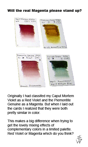
Over the next few posts I’m going to talk more about my journey into color theory, including making my own “color cards” to help me better understand how colors can work together harmoniously. Eventually, I’ll also be talking about my own creative workbook of experiments to help me use my theories to good effect. Yes, my process is still-on going. But that’s great because if it were already over I’d be very disappointed.

Friday, July 16, 2010

New page for the day and a new pen

Here's my journal page for today. It was drawn with my new Parker fountain pen which writes and draws like a dream! I never thought I'd get myself a really nice pen but I sprung for it (and some Noodler's black ink.) I figure use the best and you won't regret it. The drawing was done in pen & ink with china pencil. :-)


Shock and Awe

As I was reading “The Creative License” today I was shocked and delighted to read the section aptly entitled, “Shock: Blasting Your Butt Out of A Rut.”

Horrifying as it sounds, I realized that shock might just be the best remedy for artistic fear.

“What I am really discussing here is creativity,” Gregory says, “We must understand that creativity is both essential to survival and anathema, too. That’s why it can be so hard to overcome the resistance we have to our own creativity, why it causes us such a deep sense of fear and dread. And why artists are so reviled in our fat, contented world.”

The creative act initiates growth and change. It challenges the established order. But this means that meek, little old me, who never anticipated challenging ANYTHING, does so by the very act of creating a new drawing. Furthermore it means that in general, artists change the world every time they create something new. Many people don’t feel comfortable with change. Artists are people. Therefore many artists feel uncomfortable with change. Even in themselves!

Gregory continues, “to be creative you must be brave and allow yourself to take risks.” Playing it safe is a big part of why I’ve been so afraid to connect the two sides of my brain.

If you allow yourself the chance to create freely, whether it’s in your daily sketch journal, on a canvas, or in any other medium, you are doing something wildly expansive. That very act of creation is a huge thing! It’s why we’re artists. Being a creative risk-taker is not encouraged in many households, and perhaps not in society in general. This is a great shame. Perhaps small acts of creativity are actually very large acts of courage. I say yes!

Speaking of acts of courage…here is my journal sketch from yesterday. I’m finding I miss color in my drawings. (I like watercolor in journals the best!) This particular journal can’t really handle wet media, but I have others under way that can. Perhaps I won’t wait as long as I’d planned to bring color back in. It does so brighten up a page. ;-)


Wednesday, July 14, 2010

No wonder my eyes are sore!

I've just realized that I've done nineteen contour/negative space drawings in the past three days. No wonder my eyes are red!!!

Journaling with pictures

Having practiced (or remembered) the basics of drawing, Gregory now leads his readers into sketch journaling. He has some wonderful things to say about keeping a sketch journal.

Two of my favorite quotes are :

Your pen line becomes your mantra – non-judgmental, completely present, tying you to everything else.”

And “Journal-making is about believing in yourself, celebrating your life, having adventures, and feeling a part of (not apart from) the Universe. It’s also real fun.”

Essentially he means start playing with your drawing. Treating your drawing as play is a wonderful way to get out of the rational part of your mind and into the free-flowing, adventurous part.

 Journal Day 1
Journal Day 2 - OR  I'm so not a morning person!

I have kept sketch journals before (you've seen plenty of sketches from them in this blog) but usually to some purpose. Exploration of themes for an illustrated story, trying out specific art tools, or remembrances of SIFF 2010 for example. The latter example is the one that comes closest to what Gregory is talking about. But it wasn’t spontaneous or casual. It was serious drawing…at least to me. So I totally get the “make mistakes,” “don’t take it too seriously while joyfully exploring your world”  advice. I get that, I really do. Unfolding and allowing yourself to make mistakes (like for instance bad drawings) is really important, and I’m realizing right now that it is something that I am not used to doing.

Squandering art supplies…? Yikes! Making bad drawings! Eeeee – not me! Muddy paintings…don’t even go there! Well, today is Day Two of my new journal and I’m telling you here and now that I’m in it for the mistakes, bad drawings, poor perspective…and all. Happily for you I’m not going to post the worst of it here (I still have my pride, at least right now) but I will promise to post some of the interesting stuff. :-)

And so the journey through “The Creative License” continues…

Tuesday, July 13, 2010

Taking it outside...

Just a few more contour drawings before I continue on through the book's exercises.

The first is a contour drawing with minimal detailing of my white Subaru, "Belle." I don't usually draw cars so I think the contour drawing process helped me see it more correctly and get it looking pretty close to real. The squished front end comes from drawing the car on two sheets of paper and then tacking them together. Sometimes with blind contour drawings you simply lose track of your paper and need to add more or leave your drawing only partially completed.


Contour drawing of Belle 

The second drawing is of a fairly complex tree shape in my backyard. Again a contour drawing with minimal details.

Contour drawing of tree

Both of these drawings could definitely profit by the addition of some color. I left them monotone deliberately just as I also left them with only minimal contrast marks, simply because of the nature of the exercise. Simple lines, not much else.

Monday, July 12, 2010

About Shape & Form

I‘m really glad I picked up “The Creative License!” I’m also glad that I’m not too proud to get back to basics for a little while. I’d forgotten that an artist’s eyes can get a little dull and their brain's even duller! It’s been a long while since I’ve done any contour drawings and although I use negative space all the time, I’d really forgotten the feeling of combining the two. I realized a couple of things in my drawings today.
  1. Objects that you don’t mentally categorize as particular objects are much easier to draw. The drawing process then becomes relatively stress-free as the shapes stay simply - shapes.
  2. Complexity is a trap that can be avoided by #1.
  3. Minimal detailing, if it’s correctly placed, can be used to maximum effect.
Here are a selection of drawings from today. All are drawn in ballpoint pen with no corrections. The only exception is the camel which had exactly two corrections.

Negative space drawing of a chair - partial.
Negative space drawing of a table with a horse statue on top.
Amazing how much information can be gleaned
from such little detail.
 
Negative space drawing with contour.
Cell phone wireless headset. A very complex shape drawn
without stress due to the lack of conceptual thought during the drawing process.


Contour drawing using negative space
with minimal detailing added.
Table grouping of eyeglass case, phone, cell phone.

 
Contour drawing using negative space, with minimal detailing
added based on relative positioning. Stuffed camel.
An amazingly stress-free drawing. In fact, quite easy to do!

I’m delighted with today’s process. Especially as the goal of this “Creative License” project is to expand my creative process and not learn how to draw. (I already know how!) It would be a good day regardless, but the reconnection with these very valuable drawing tools (contour, modified contour, negative space, minimal detailing based on relative positioning) is well worth the effort.

Sunday, July 11, 2010

Creativity Tonic

For many years I have felt a disconnect or short-circuit between the two sides of my creative life. I have mastered the ability to create a professional piece of art “on demand.” I don’t think about my desires in this, I simply create a portrait, or needed illustration, poster, advertisement, or whatever. However, there is another part of my creative soul that has become the “poor stepchild.” When I need to access this pure, creative, truly FUN part I can do that too but the path to get there is very hard to access. It feels as if it is full of downed treelets and covered by weeds. It takes some finesse to find the trail, let alone follow it easily. For many years I have taken pains to put down different sorts of bread crumbs to mark this trail so that when I do want to travel upon it, I can even find it!

Recently I realized that this disconnect is causing me physical sadness. I wished to find out where the short-circuit was and heal it. I took some time to consider the right path to do this, finally coming to a book called “The Creative License,” by Danny Gregory. Gregory also wrote “Everyday Matters,” and “An Illustrated Life.” When I picked up the book at my local bookstore yesterday I saw that it had a recommendation from the author Sark on the bottom edge of the cover. When I saw that I knew I’d found the right book. I’ve always been a huge fan of Sark and her books, like “Living Juicy.”

I started reading it today. The beginning exercises are similar to Betty Edwards’ “Drawing on the Right Side of the Brain,” a book I have always loved and taught from for many years. But this book has more in it, that much is clear. It seems to be about giving yourself artistic permission to play. At least that’s my initial impression. It’s something that I could really use a hand with.

Already familiar with contour drawings I started moving through the book’s exercises today. Here are the series of blind and mostly-blind contour drawings. I have always found these simple drawing exercises quite beautiful to do. Peaceful in execution and they always look “right.”  Although I have more commercial projects on my table at the moment, I’m going to give myself the gift of making time to add Gregory’s exercises into my artistic routine. This feels really good to me. It’s high time to get both sides of my brain working together in harmony.

Contour Drawings from Sunday


Thursday, July 8, 2010

WTF Art Show Opened Last Night

A lovely opening for the art show last night. I really enjoyed going. It was a bit nerve-racking seeing my pieces (so small! And with such tidy but low-key frames!) hanging there in such great company! The quality of art was quite good and the entire atmosphere was clearly about enjoying the art of the horse. Thanks to everyone involved for putting on a such great show! The show hangs during racing hours until Sunday.

“Waiting For his Class” with a bit of Photoshop magic added.
I think maybe I should start working bigger...

 
 “Man & Horse” again called out with PS.

The atmosphere of the show…


Tuesday, July 6, 2010

“Best Friends” completed

Today has been a busy day! First stop this morning was to deliver my pieces to Emerald Downs in Auburn. On the way home, I stopped by Daniel Smith's Arts in Seattle (the BIG store!!) and picked out a new mat cutting system so that I will never again go through the hell that I did on Monday while trying to cut two simple mats! *deep breath* After that it was home to finish (among other things) my newest piece, “Best Friends.”

“Best Friends” 9”x 12” Derwent Drawing Pencils

I like this piece. It has the nice companionable feel I was hoping for. I even came to respect the Derwent Drawing pencils by the time I was done. But then…the ultimate question (drum roll please)…would I use these pencils again for a piece like this? And the answer...Probably not. Everything I did with them I could have more easily and comfortably done with Prismacolors. But would I take them with me to sketch in the field? For that, probably yes. They are pretty nice pencils, after all. They make me itch to try them out on colored paper, using the paper as the mid-tone and the pencils to provide the high and low lights. I can definitely see that they might be fun for that. Perhaps I’ll set that up as their next test. But that’s for later. For now I have several other pieces in mind which will be either straight colored pencil, water-soluble pencil, watercolor, or more likely some kind of combination.

So here's to it. Onwards and upwards!

Monday, July 5, 2010

Pieces for the WTF Art Show

Here are pictures of the two pieces I’ll be hanging at the WTF art show this coming week.

“Waiting for His Class” Prismacolor Pencils 7” x 5 5/8”


“Man and Horse” Tinted Graphite, Watercolor 7” x 10”

Hope to you can make it out to Emerald Downs to see the show!

Friday, July 2, 2010

WA Thoroughbred Breeders 2010 Art Show


I am delighted to announce that I will have two pieces, “Man and Horse,” and “Waiting for His Class” entered into the WA Thoroughbred Foundation/WA Thoroughbred Breeders 2010 Art Show at Emerald Downs in Auburn, WA. The show runs from July 7th-11th. From all I’ve heard this will be a lovely event and I’m very excited to be a participant. If you’re in the area I hope you'll stop by!

More Ponies

Here’s the latest update on the ponies.

 "Best Friends"

It seems to be progressing alright but I find myself still struggling somewhat with the medium. My main complaints with the pencils are that I am having trouble getting the details sharp enough, AND that the colors available to me are so limited in range. The colors of the Derwent Drawing Pencils that I have (I have the 12 piece set and there are 24 total) are all analogous and/or quite muted. Although this can be a huge selling point, after all my recent work practicing mixing interesting greys and lively neutrals, I’m finding it quite the limitation.

The funny part is, I’ve been saying for weeks that I wanted to expand outward from the “usual” animal color palette of umber’s, ochre’s, russets, and bluish/greenish greys. Yet those are exactly the color choices of the Derwent Drawing Pencils! Perfectly funny! AND proof positive that I knew what I wanted all along. This piece is making me want to return to watercolor, or wax-based colored pencils, ASAP!

Although I can make a piece work using this palette (and these pencils), I miss having at least some blue-violets available for the shadows and/or cyan or bluish-turquoise to neutralize some of the sienna’s. Oh well, best make this piece as beautiful and evocative as I can and then return to a medium that I really love! Watercolor!