Yesterday I forgot to mention my very favorite color name, “Caput Mortuum” or “Caput Mortuum Violet.” Winning the title of most interesting color name in my book, Caput Mortuum literally means “Dead Head” or “Worthless Remains.” It is also known as “Cardinal Purple.” According to Wikipedia it has also been known as “Mummy Brown,” from a practice in the 16th and 17th centuries of making the pigment from ground up mummies. They stopped the practice in the 19th C. when artists found out what it was made of . ;-)
Name and history alone make it interesting, but I really like the color too. I consider it a rather dull Red-Violet and use it in several of my watercolor palettes.

Tuesday, November 30, 2010
Monday, November 29, 2010
Interesting Color Names
I was looking through my colored pencil stock this morning and was struck, and not for the first time, by some of the unusual color names we regularly see in our artist's palettes. Some of these names are so ubiquitous as to be ordinary-sounding to us, even though they are pretty obscure words used to describe a color.
For example, take the word “Phthalo.” That initial “Ph” is so strange! It took me forever to learn to spell it correctly. Some other strange-sounding color names are “Geranium Lake,” (I get the "Geranium" but what’s the deal with the "Lake?"), and “Permanent Green.” (Why is it more permanent than other greens?) I’ve always been fascinated by the word “Fuchsia” but have no idea what is means or where it comes from. (I have had Fuchsia plants before but which came first the plant or the color?)
I’m sure there are easy-to-find answers to these questions but that’s not really the point. The point is that our painting boxes are filled with amazingly, evocative names that we rarely ever notice.
My current favorite color names are “Helio-Blue Reddish” and “Chrome Oxide Green Fiery.” Wow! I'm not sure they make any sense as far as names go but they sure sound good, don't they?
What are some of your favorite color names?
For example, take the word “Phthalo.” That initial “Ph” is so strange! It took me forever to learn to spell it correctly. Some other strange-sounding color names are “Geranium Lake,” (I get the "Geranium" but what’s the deal with the "Lake?"), and “Permanent Green.” (Why is it more permanent than other greens?) I’ve always been fascinated by the word “Fuchsia” but have no idea what is means or where it comes from. (I have had Fuchsia plants before but which came first the plant or the color?)
I’m sure there are easy-to-find answers to these questions but that’s not really the point. The point is that our painting boxes are filled with amazingly, evocative names that we rarely ever notice.
 |
| Some interesting color names in my colored pencil collection |
My current favorite color names are “Helio-Blue Reddish” and “Chrome Oxide Green Fiery.” Wow! I'm not sure they make any sense as far as names go but they sure sound good, don't they?
What are some of your favorite color names?
Thursday, November 25, 2010
Finally…Baxter!
 |
| "Baxter," Prismacolor Pencil on Canson paper 9"x12" |
Wow! It took me a long time to finish this piece. If it had been a commission it would have been done long ago. But since it was being done as a memory piece for me, I let other pieces get ahead of it for a while. I’m glad to see it finally done. And on Thanksgiving Day too!
Somehow that’s appropriate as I met this little guy and his “Dad” while on the cross-country trip to pick up my recently deceased Mom’s things from Vermont. He was visiting with his Dad the night we stayed at a motel in Vermont. Baxter had been recovering from a bite from a “bad bug” (a tick) and needed to be watched over and given his medicine. He was just so cute with his huge ears and winning attitude. I couldn’t resist photographing him for a later portrait. If only I could remember exactly where this motel was I’d let his Dad know about it.
Oh well. The Internet is large. Perhaps by good chance he’ll hear about it on my blog or Flickr. You never know… ;-)
Monday, November 22, 2010
Steamcon II: Weird Weird West!
We ventured far to SeaTac, Washington this weekend for the delightfully madcap and adventure-filled SteamconII: Weird, Weird West. There we met a fabulous assortment of people, wearing amazing clothing! Of course, not to be undone in the face of fashion, I went as my Steampunk alter-ego, Professor Almira Styles of Hawk’s Nest Observatory in Cambridge, Mass..
While there we were entertained by many wonderful talks about the nature of airships, haberdashery, and social issues particular to the Steampunk genre. It was amazing and fun!
Here are my sketches from the event. Drawn in an old surveyor’s notebook in Pitt pen mainly.


And speaking of hats…here’s mine from the convention. A Christmas hat featuring clockwork birds. Tra la!
For more pictures from this extraordinary event you can take at peak at Sara and Matt's Steamcon II Shutterfly album.
Cheerio to all!
 |
| Professor Almira Styles |
Here are my sketches from the event. Drawn in an old surveyor’s notebook in Pitt pen mainly.


And speaking of hats…here’s mine from the convention. A Christmas hat featuring clockwork birds. Tra la!
 |
| Detail of my Christmas hat featuring clockwork birds. |
Cheerio to all!
Friday, November 19, 2010
The story of my first true landscape
I love light houses. They’re so romantic. Lonely protectors of the coast. Always apart. Solitary and strong. How can anyone resist them?
Before leaving for Hawaii I had seen pictures of the Kilauea Lighthouse on Kauai. It looked so beautiful. A lighthouse surrounded by Kauaiian scenery. How could I resist?
The trip to Kilauea was fabulous in and of itself; a beautiful tour around the north end of Kauai. The overlook was stationed just outside the gates of the National Park Service site. I stood at the overlook and sketched the distant lighthouse to get a feel for it.
The park itself was lovely and interesting. Here we got our first look at the Hawaiian goose, the Nene. We also saw protected seabird nests with tiny, fluffy, baby birds resting in little, circular, nesting caves along the path to the lighthouse. The lighthouse itself was undergoing renovations and we were unable to go inside, but the views from the cliff top were incredible.
How could I resist painting a landscape or two based on that beautiful spot?
Here is the first of them. As I worked out the preparatory sketches for this painting I reflected on how I had never done a landscape by itself before. Oh sure, I have painted landscape backgrounds for use in portrait or illustration pieces. But this was different. An appreciation for the place as subject by itself. The action of painting this piece broke the ice for me in a new way. I’m now really looking forward to exploring other landscape subjects, including doing more pieces in this series.
The piece was painted in a limited palette – a tetredic square of Yellow- Green, Red-Orange, Red-Violet, Cyan. (I also used a touch of Quinacridone Gold to glaze some of the foreground foliage left side – but so little I don’t think it unbalanced the color square.) I used several shades from each color category with Yellow-Green being the dominant color. I feel this provided a harmonious mix of colors. I’m pleased by how the colors are a bit warmer and “more tropical” than they were in the photo I used as reference. They are more accurate to my memories of the place.
As a Post Script to this posting. I’ve made a few technical corrections to my 11/13/10 post “Great Workshop at Daniel Smith's.” Apologies for the slightly incorrect Polychromos product descriptions. All should be corrected now.
Before leaving for Hawaii I had seen pictures of the Kilauea Lighthouse on Kauai. It looked so beautiful. A lighthouse surrounded by Kauaiian scenery. How could I resist?
The trip to Kilauea was fabulous in and of itself; a beautiful tour around the north end of Kauai. The overlook was stationed just outside the gates of the National Park Service site. I stood at the overlook and sketched the distant lighthouse to get a feel for it.
 |
| Kilauea Lighthouse sketch |
The park itself was lovely and interesting. Here we got our first look at the Hawaiian goose, the Nene. We also saw protected seabird nests with tiny, fluffy, baby birds resting in little, circular, nesting caves along the path to the lighthouse. The lighthouse itself was undergoing renovations and we were unable to go inside, but the views from the cliff top were incredible.
How could I resist painting a landscape or two based on that beautiful spot?
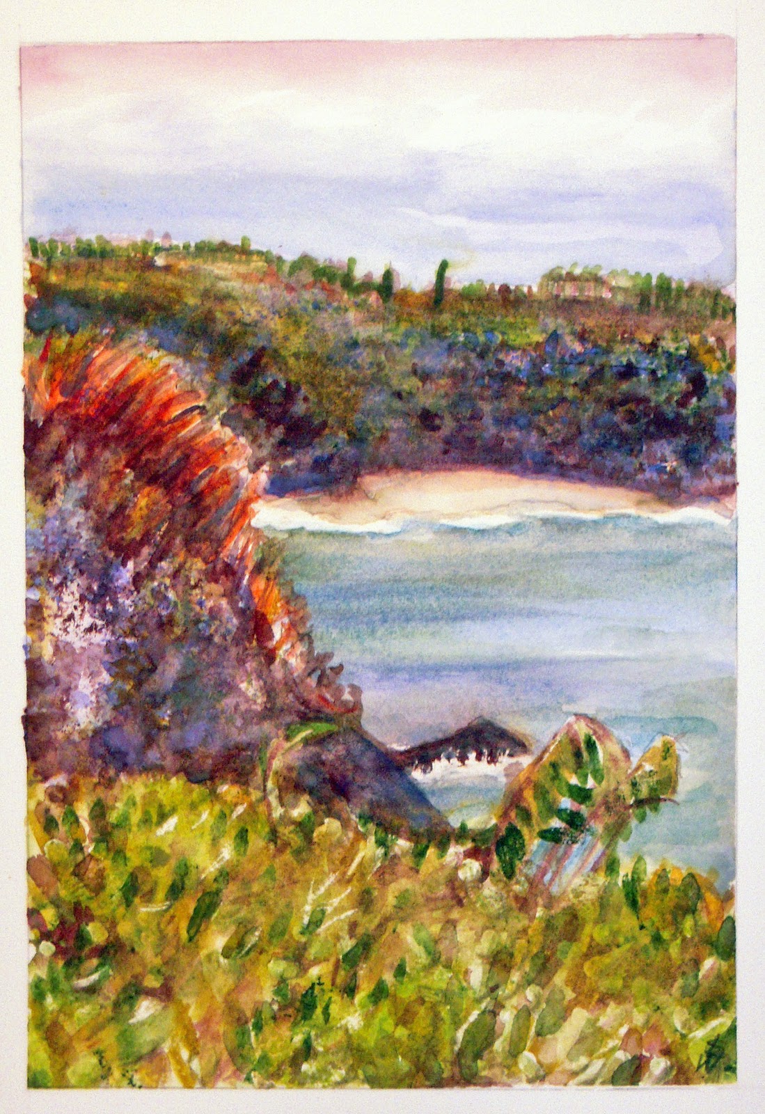 |
| “Kilauea Lighthouse Overlook, Kauai" Watercolor. 7" x 10" |
The piece was painted in a limited palette – a tetredic square of Yellow- Green, Red-Orange, Red-Violet, Cyan. (I also used a touch of Quinacridone Gold to glaze some of the foreground foliage left side – but so little I don’t think it unbalanced the color square.) I used several shades from each color category with Yellow-Green being the dominant color. I feel this provided a harmonious mix of colors. I’m pleased by how the colors are a bit warmer and “more tropical” than they were in the photo I used as reference. They are more accurate to my memories of the place.
As a Post Script to this posting. I’ve made a few technical corrections to my 11/13/10 post “Great Workshop at Daniel Smith's.” Apologies for the slightly incorrect Polychromos product descriptions. All should be corrected now.
Monday, November 15, 2010
Playing with Pitt Design Pens
Inspired by the workshop last Friday, I have been experimenting with the Pitt Design Pens. I was really impressed by Don Colley’s use of the Pitt pens for monochromatic drawings. He explained that you can create a high density of color by building up transparent layers of color with the pens. Several times during the workshop, I saw him go back into “completed” drawings to darken a line or two to prove his point.
Here are two of my sample pieces. A human and an equine portrait. I’m finding that these pens give an amazingly illustrative feel to the artwork. They require you to work boldly; markers generally require a certain brash élan!
So far I like them. They make bold statements. Amazingly, they are NOT bleeding through the paper despite the heavy density of color I have been using. That's truly amazing!
I’m planning to take them with me to Steamcon II next weekend in my sketch kit. It'll be interesting to see how they do on a field trip. :-)
Here are two of my sample pieces. A human and an equine portrait. I’m finding that these pens give an amazingly illustrative feel to the artwork. They require you to work boldly; markers generally require a certain brash élan!
 |
| Ayla |
 |
| Prospero's Magic in Arizona |
So far I like them. They make bold statements. Amazingly, they are NOT bleeding through the paper despite the heavy density of color I have been using. That's truly amazing!
I’m planning to take them with me to Steamcon II next weekend in my sketch kit. It'll be interesting to see how they do on a field trip. :-)
Saturday, November 13, 2010
Great Workshop at Daniel Smith's
Yesterday afternoon I headed to Daniel Smith’s in Seattle for a free workshop given by Chicago artist/illustrator Don Colley. This workshop was sponsored by Faber-Castell and explored the characteristics of a variety of Faber-Castell products including Pitt Artist Pens, Albrecht Durer watercolor pencils, Polychromos colored pencils, and pastels for use in multi-media art pieces.
Don Colley is a wonderful speaker and a fabulous artist. His urban sketches created on huge, old, ledger books are truly a wonderful and very characteristic art. His manner was bright and lively as he described the products he uses in his art and illustration work.
Two of the media I use frequently in my artwork are colored pencils and pen & ink. After so many years of use, I had stopped asking a lot of product questions about either tool. I have used Prismacolor pencils for more than 20 years and have been satisfied with them for the most part. As far as ink pens go, I definitely have my favorites, with the Pitt Superfine (S) black pen being among them. I have also used the Pitt artist brush pens on a limited basis, with my primary use being calligraphy. I have been delighted with the Albrecht Durer watercolor pencils and have a large set of them. My painting “Please May I Come Up,” is done in the AD watercolor pencils.
With all that said, I was surprised and delighted to learn some amazing new things at the workshop yesterday.
Pitt Artist Pens:

Here’s are result. Perfect matches for color between the Polychromos and the AD watercolor pencils and a close match with the similar (but not exact number) Pitt brush pen. A success! I may now have to invest in a line of the Polychromos colored pencils since I won’t be able to mix and match them with my old Prismacolors. That would be oil and water! (or at least oil and wax – not a good match…)
Many thanks to DS blogger Deborah Burns for the timely heads’ up about this great workshop. A super afternoon event at Daniel Smith’s!
Don Colley is a wonderful speaker and a fabulous artist. His urban sketches created on huge, old, ledger books are truly a wonderful and very characteristic art. His manner was bright and lively as he described the products he uses in his art and illustration work.
Two of the media I use frequently in my artwork are colored pencils and pen & ink. After so many years of use, I had stopped asking a lot of product questions about either tool. I have used Prismacolor pencils for more than 20 years and have been satisfied with them for the most part. As far as ink pens go, I definitely have my favorites, with the Pitt Superfine (S) black pen being among them. I have also used the Pitt artist brush pens on a limited basis, with my primary use being calligraphy. I have been delighted with the Albrecht Durer watercolor pencils and have a large set of them. My painting “Please May I Come Up,” is done in the AD watercolor pencils.
With all that said, I was surprised and delighted to learn some amazing new things at the workshop yesterday.
Pitt Artist Pens:
- Are just pigment and water and therefore have no odor like other markers. (I had not paid attention to this before but now that you mention it…)
- Will set up and be permanent and waterproof but can be smudged immediately after they’re laid down.
- Are transparent and can be built up in layers like other wet media.
- DO NOT BLEED THROUGH PAPER!
- Are bound in oil (not wax as are Prismacolors) and so will not “bloom” when laid down in heavy concentrations of color. Waxy bloom is observed as a white sheen that can make a piece look dull and opaque. As I use heavy concentrations of color in my colored pencil pieces, not having to worry about waxy bloom building up is a huge revelation for me!
- According to the Faber-Castell website the color leads are 3.8mm, break-resistant, water-resistant, and smudge-proof. The Polychromos leads are glued down the entire (inside) length of the pencil casing thereby creating a stronger pencil overall.
- All the Faber-Castell products (pens, colored pencils, watercolor pencils, pastels) are color-indexed and each same-numbered color will be consistent across the entire product line.

Many thanks to DS blogger Deborah Burns for the timely heads’ up about this great workshop. A super afternoon event at Daniel Smith’s!
Thursday, November 11, 2010
More fast sketching
For the past few weeks, I have been working on my fast sketching techniques as often as I can. Improving these skills has helped me make my sketching time much more fun and rewarding. How different from trying to capture a subject quickly as a detailed rendering! That was just so frustrating and I could never figure out why! Now I know. David Rankin is right, the process for sketching fast is very different from the creation of a careful rendering. Fast sketches aren’t meant to be detailed, they’re just meant to be visual “notes.” Now I don't get bogged down in feeling rushed while I sketch, I just get the basics down, maybe take a photo for later, and I'm done. Really cool!
Here are some of my recent fast sketches. These horses live at one of the farms where I do massage regularly. They were all good sports about being artistic subjects. ;-) Each one of these sketches took an average of three minutes to draw. All are soft pencil shaded with a stump.


Here are some of my recent fast sketches. These horses live at one of the farms where I do massage regularly. They were all good sports about being artistic subjects. ;-) Each one of these sketches took an average of three minutes to draw. All are soft pencil shaded with a stump.


Monday, November 8, 2010
Thank you Agfa SnapScan 1212
 |
| My old Agfa scanner - is this company even in business anymore? |
With the prospect of marketing greeting cards dawning on my horizon, I knew I’d need to upgrade to a newer piece of scan/print technology. Enter the HP Photosmart Premium All-In-One. It slices. It dices. It makes julienne fries…well, not really. But it does print, scan, copy, and probably do several other things I haven’t yet read about in the manual. The scans are amazing and it prints photos like a dedicated photo machine. Phew! I’m happy. :-)
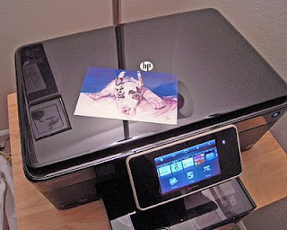 |
| New HP scanner complete with photo print of my artwork |
Still, it wouldn’t have been right to retire the old machine without giving it a fair send-off. Thank you, Agfa Snapscan 1212. You took me through a lot of years and I am grateful. Whoever said that technology can’t have a heart?
Saturday, November 6, 2010
Watching Pony 1
 |
| "Watching Pony 1" |
Thursday, November 4, 2010
The Mess in My Study – Drawing Nene
So about this process that has been creating a mess in my study….
Since getting back from my recent trip, I have wanted to paint a Hawaiian scene including the state bird, the Hawaiian goose or “Nene.” For the past week or so I have been fiddling around with compositional armatures and colors palettes for this hypothetical painting. I’ve also done some color studies of the birds themselves to better understand their anatomy and how to render the feathers.
I love telling stories too! I feel so cheated by myself. But now I remember…and there’s no turning back now! Part of the point of today’s blog post is so that I won’t forget this very important point again (at least not soon.) Now that it’s all out in the open I have a physical marker to remember for the next time. (I can also remember to have a good laugh about it!)
Now I just need to make up a story about a sweet and gentle goose that is considered fairly stupid by the locals because it’s easy to catch. How hard can that be? (Actually it sounds like the beginning of a story for children. Hmmmmmm.) Well, here’s to it! ;-)
Since getting back from my recent trip, I have wanted to paint a Hawaiian scene including the state bird, the Hawaiian goose or “Nene.” For the past week or so I have been fiddling around with compositional armatures and colors palettes for this hypothetical painting. I’ve also done some color studies of the birds themselves to better understand their anatomy and how to render the feathers.
 |
| My messy drafting table |
But something was missing. Something felt critically flat about my entire process. Then, just about a second ago, I remembered something. Something tremendously important! Paintings aren’t just about the details of composition, color, light, etc.. No! Paintings tell stories! How could I have EVER forgotten such an important thing? Forests? Trees? Hello?
 |
| My process |
I love telling stories too! I feel so cheated by myself. But now I remember…and there’s no turning back now! Part of the point of today’s blog post is so that I won’t forget this very important point again (at least not soon.) Now that it’s all out in the open I have a physical marker to remember for the next time. (I can also remember to have a good laugh about it!)
Now I just need to make up a story about a sweet and gentle goose that is considered fairly stupid by the locals because it’s easy to catch. How hard can that be? (Actually it sounds like the beginning of a story for children. Hmmmmmm.) Well, here’s to it! ;-)
 |
| Sweet and gentle geese, Nene |
Monday, November 1, 2010
The Artistic Process
Art is a rather long, uncertain, and bumpy process. I doubt that anyone in the arts would gainsay that statement. In fact, I’m certain of it! Our artistic trial and error learning process is at best freeing, and at worse, makes you want to upend your drafting table and turn your back for good. In some ways, I did that, for a ten, long years. But I couldn’t stay away, not forever. The pull of one more pencil stroke, another experimental pen line, or one more layer of color glazed over the others, may be what gets us in to trouble sometimes, but it’s also what saves us. How? Curiosity and experimentation is the soul of learning and, in this case, the soul of art too. “Mistakes” can be intimidating, and are often infuriating, but can also lead to new awarenesses and that’s a GREAT thing. It’s part of the learning process that just about kills us, but somehow, masochistically, also keeps us coming back for more.
For the past few days I’ve been working out some new compositions and really beating myself up about it. Tonight, as I listen to my favorite Harry Connick Jr. CD, I contemplate the mess that my study has become and I think, “what is all this for?” But then I pause, and look at the watercolor study on my table and think…is it really SO bad? What has it taught me?
I believe that if you can name at least a few things that a piece HAS taught you as you stumble through it, it has served its purpose nobly. After all, not every piece is destined to become an award winner. Some have the more important role of “learning tool.” With that thought in mind, what’s a few awkward passages, or some over-mixed colors really? Next time maybe you’ll be able to do better BECAUSE of that wonderfully lacking piece that...shhhh...wasn’t really all that lacking after all.
Subscribe to:
Posts (Atom)