 |
| "Portland Japanese Gardens" (4.5" x 6.5") Pen and ink in Stillman and Birn Epsilon sketchbook. |

Showing posts with label travel sketches. Show all posts
Showing posts with label travel sketches. Show all posts
Wednesday, October 7, 2015
Drawing of the Day


Tuesday, August 4, 2015
A Third Scene from Portland's Japanese Garden
 |
| The Flat Garden @ The Japanese Garden pen & ink in a Stillman and Birn Epsilon sketchbook |
The Flat Garden creates an ideal subject for pen & ink. The great expanse of white sand makes a perfect contrast to the other features — wooden railing, diverse greenery, and characteristic stones. The challenge is to add enough contrast to the greenery to make it look diverse.
While doing these sketches I recall the memory of the garden in a very Zen fashion. Peace returns.
Monday, August 3, 2015
Sketches from Portland's Japanese Garden
 |
| Two Scenes from the Japanese Gardens Pen & ink in a Stillman and Birn Epsilon sketchbook |
These are the first two.
Saturday, July 18, 2015
Sketch of the day – Carnival at Harvey Field
 |
| "Carnival at Harvey Field" pen & ink and marker in a Stillman & Birn Epsilon journal |
 |
| Sketch in progress |
It’s Kla Ha Ya Days this weekend in Snohomish and with the
festivities comes a carnival at Harvey Field. I’d been looking at the rides for some
days and decided to head in this morning and draw
the Ferris wheel before the rides were open. I sat in an empty field and drew for a few hours as people
around the fair got ready for the day. It was super nice. :-)
 |
| The carnival |
Tuesday, July 10, 2012
Which are my favorite sketching tools right now?
Hands on hips, this was the question I asked myself the other
day as I took stock of the many types of pencils, paints, markers, etc. that I
saw lined up before me. For outdoor sketching adventures, I’ve created several small
kits that I rotate through depending on what I’m feeling like that day. My three favorite
sketch kits are 1. a small pen & ink and watercolor kit, 2. a small fast-sketch
kit with various stumps and graphite pencils, and 3. a watercolor pencil/Neocolor
II kit (my most recent favorite.)
I thought I might further refine my sketch kits further based on what tools
I’m having fun using right now. But
how best to check on the fun level for each tool? I decided to create a
test of sorts for myself. I started by drawing a new coloring book
page that I would then color with different tools. That would show me which tools would
best fit my current needs. This also would also help me organize a new palette of colors
for the kinds of outdoor places where I tend to sketch (horse farms, local NW
scenes.)
It was a fun exercise.
Here is the line drawing I used. I photocopied the image several times onto heavy, white cover stock pages for my test.
 |
| A new pen & ink image to color. |
Coloring page #1 - Tombow
Dual Brush Pens and Pitt Design Pens (magic markers). I liked the look of this colored image. I
thought it was very cute. I think that markers might give my sketching scenes something of an illustrative quality.
 |
| This image was colored with Tombow Dual Brush Pens and Pitt Design Pens. |
Coloring page #2 - Neocolor II watersoluble crayons. I
liked the look of this page too but there’s a problem with using crayons in
the Summer…they melt in hot cars! Frequently, my sketch kit sits in the trunk
of the car for hours until I get a moment to sketch.
 |
| This image was colored with Neocolor II crayons. |
Coloring page #3 - Inktense watersoluble pencils.
Inktense pencils are really cool for several reasons. The first is that their
pencil leads are made of watersoluble ink. After the ink has been wet once it will
never be watersoluble again. So you can build up your image without moving or
changing the underlying layers. I find that the transparency of the Inktense colors also works
especially well with pen & ink drawings. As another fun feature, the colors are
extra bright.
 |
| This image was colored with Inktense watersoluble pencils. |
Coloring page #4 - watercolor pencils (Cretacolor
and Supracolor). These are the pencils that I have been using in one of current
sketch kits. They are very user friendly, travel well, and lay down
good color either dry or when wet with a waterbrush. Although the look isn’t as bright as with
the Inktense pencils they are more versatile for many subjects.
 |
| This image was colored with Cretacolor and Supracolor watercolor pencils. |
So which ones where the most FUN to use?
The results were an essential tie! I have to give the nod to
both the Tombow/Pitt markers and the Cretacolor/Supracolor watercolor pencils. I think both will serve my needs very well and are very fun to use.
Evening update!
I have since created two new sketch kits – one with the markers and one with the colored pencils and I’ve bundled them together into the same little carry bag. Now I feel ready for all sorts of new adventures! Tally ho!
I have since created two new sketch kits – one with the markers and one with the colored pencils and I’ve bundled them together into the same little carry bag. Now I feel ready for all sorts of new adventures! Tally ho!
Tuesday, August 16, 2011
Visiting Obstruction Island
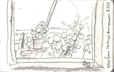
I was fortunate to visit the home of premier watercolorist, Caroline Buchanan, last weekend on the San Juan Islands. It turns out that Caroline was a very dear friend of my recently deceased mother-in-law, Kim Waller. I remember Kim telling me many times that I should take some classes from Caroline, but in typical “child” fashion I didn’t take the suggestion too seriously. After all, Kim never even told me Caroline’s whole name!

Caroline was a gracious hostess and we had a wonderful visit. Besides talking poetry (Kim had been a published poet) we spoke a lot about art. It was really amazing looking at her artwork and gleaning wisdom about painting at every turn.
Although there wasn’t much time to draw in the short time we were there I did do a few quick sketches. Funny to think of such fast sketches as representative of time spent with a watercolorist like Caroline, but they will always remind me of the details. Matt worked the camera on this trip and me the pencil. And that worked out just fine!
So will I take a workshop with Caroline in the future if I get the chance? Yes, absolutely! Thanks Kim for the suggestion. ;-)

 |
| Knick nacks on high shelf |
 |
| Cabin panorama |
 |
| Window view |
 |
| Ferry moments |
Tuesday, July 5, 2011
New sketch kit
Happy (US) Independence Day! I hope you all have had a good and safe holiday. We had a really nice day cruising around the area looking at homes for sale, baking cookies for a nice elderly couple next door and finally going to a wonderful party at a neighbor's home. :-)
This past weekend I decided to redo my current sketch kit. The old one just wasn't feeling quite right any more. Here’s my new configuration.
I have added all new half pans to my old Winsor & Newton Cotman travel watercolor box and filled them with a new palette of Daniel Smith watercolors. Here are the colors I’ve chosen: Lemon Yellow, Cadmium Yellow Medium, Quinacridone Gold, French Ochre, Transparent Red Oxide, Transparent Pyrrol Orange, Quinacridone Coral, Cobalt Blue Violet, Cobalt Blue, French Ultramarine, Venetian Red, Sepia, Serpentine Genuine, and Payne’s Grey.
Also in my kit I have two Noodler’s Flex pens (one filled with Platinum Carbon Black and the other with Noodler’s Fox Red), two waterbrushes, a ruler, pencil, tiny eraser, and a tiny travel brush (that I may yet replace with a better folding brush.) Add to this some paper towels, a pencil case and my moleskin, and I’m ready to go.
Here are the first two sketches I made with this particular kit.


Another thing I’m working on right now is simplifying the pen work in my sketches to make more “room” for the color. I’m pretty happy with these first two attempts. Using simpler pen lines makes the entire drawing seem more peaceful and I like that. I'm looking forward to some sketching time this week for more "road testing." ;-)
This past weekend I decided to redo my current sketch kit. The old one just wasn't feeling quite right any more. Here’s my new configuration.
 |
| My new sketch kit - so far, I'm pretty happy with it. |
Also in my kit I have two Noodler’s Flex pens (one filled with Platinum Carbon Black and the other with Noodler’s Fox Red), two waterbrushes, a ruler, pencil, tiny eraser, and a tiny travel brush (that I may yet replace with a better folding brush.) Add to this some paper towels, a pencil case and my moleskin, and I’m ready to go.
Here are the first two sketches I made with this particular kit.


Thursday, December 2, 2010
Miscellany
A few miscellaneous items for today. First up, some on-site sketches from my tea holiday yesterday at Soul Food Books in Redmond. Pitt design pens in an old surveyor's notebook. I like the effect of drawing over the old pencils notes. :-)


Then on to a quote from a favorite illustrator of mine, Howard Pyle.
With thanks to Ian Schoenherr - from his wonderful blog – “Howard Pyle”


Then on to a quote from a favorite illustrator of mine, Howard Pyle.
“When in Doubt, Leave It Out”
“...it is better to err in the lack of detail than it is to introduce details that may arouse question or criticism...” -Howard Pyle to Paul Leicester Ford, November 30, 1898Words we all can profit by, even more than 100 years later. ;-)
With thanks to Ian Schoenherr - from his wonderful blog – “Howard Pyle”
Monday, November 22, 2010
Steamcon II: Weird Weird West!
We ventured far to SeaTac, Washington this weekend for the delightfully madcap and adventure-filled SteamconII: Weird, Weird West. There we met a fabulous assortment of people, wearing amazing clothing! Of course, not to be undone in the face of fashion, I went as my Steampunk alter-ego, Professor Almira Styles of Hawk’s Nest Observatory in Cambridge, Mass..
While there we were entertained by many wonderful talks about the nature of airships, haberdashery, and social issues particular to the Steampunk genre. It was amazing and fun!
Here are my sketches from the event. Drawn in an old surveyor’s notebook in Pitt pen mainly.


And speaking of hats…here’s mine from the convention. A Christmas hat featuring clockwork birds. Tra la!
For more pictures from this extraordinary event you can take at peak at Sara and Matt's Steamcon II Shutterfly album.
Cheerio to all!
 |
| Professor Almira Styles |
Here are my sketches from the event. Drawn in an old surveyor’s notebook in Pitt pen mainly.


And speaking of hats…here’s mine from the convention. A Christmas hat featuring clockwork birds. Tra la!
 |
| Detail of my Christmas hat featuring clockwork birds. |
Cheerio to all!
Friday, November 19, 2010
The story of my first true landscape
I love light houses. They’re so romantic. Lonely protectors of the coast. Always apart. Solitary and strong. How can anyone resist them?
Before leaving for Hawaii I had seen pictures of the Kilauea Lighthouse on Kauai. It looked so beautiful. A lighthouse surrounded by Kauaiian scenery. How could I resist?
The trip to Kilauea was fabulous in and of itself; a beautiful tour around the north end of Kauai. The overlook was stationed just outside the gates of the National Park Service site. I stood at the overlook and sketched the distant lighthouse to get a feel for it.
The park itself was lovely and interesting. Here we got our first look at the Hawaiian goose, the Nene. We also saw protected seabird nests with tiny, fluffy, baby birds resting in little, circular, nesting caves along the path to the lighthouse. The lighthouse itself was undergoing renovations and we were unable to go inside, but the views from the cliff top were incredible.
How could I resist painting a landscape or two based on that beautiful spot?
Here is the first of them. As I worked out the preparatory sketches for this painting I reflected on how I had never done a landscape by itself before. Oh sure, I have painted landscape backgrounds for use in portrait or illustration pieces. But this was different. An appreciation for the place as subject by itself. The action of painting this piece broke the ice for me in a new way. I’m now really looking forward to exploring other landscape subjects, including doing more pieces in this series.
The piece was painted in a limited palette – a tetredic square of Yellow- Green, Red-Orange, Red-Violet, Cyan. (I also used a touch of Quinacridone Gold to glaze some of the foreground foliage left side – but so little I don’t think it unbalanced the color square.) I used several shades from each color category with Yellow-Green being the dominant color. I feel this provided a harmonious mix of colors. I’m pleased by how the colors are a bit warmer and “more tropical” than they were in the photo I used as reference. They are more accurate to my memories of the place.
As a Post Script to this posting. I’ve made a few technical corrections to my 11/13/10 post “Great Workshop at Daniel Smith's.” Apologies for the slightly incorrect Polychromos product descriptions. All should be corrected now.
Before leaving for Hawaii I had seen pictures of the Kilauea Lighthouse on Kauai. It looked so beautiful. A lighthouse surrounded by Kauaiian scenery. How could I resist?
The trip to Kilauea was fabulous in and of itself; a beautiful tour around the north end of Kauai. The overlook was stationed just outside the gates of the National Park Service site. I stood at the overlook and sketched the distant lighthouse to get a feel for it.
 |
| Kilauea Lighthouse sketch |
The park itself was lovely and interesting. Here we got our first look at the Hawaiian goose, the Nene. We also saw protected seabird nests with tiny, fluffy, baby birds resting in little, circular, nesting caves along the path to the lighthouse. The lighthouse itself was undergoing renovations and we were unable to go inside, but the views from the cliff top were incredible.
How could I resist painting a landscape or two based on that beautiful spot?
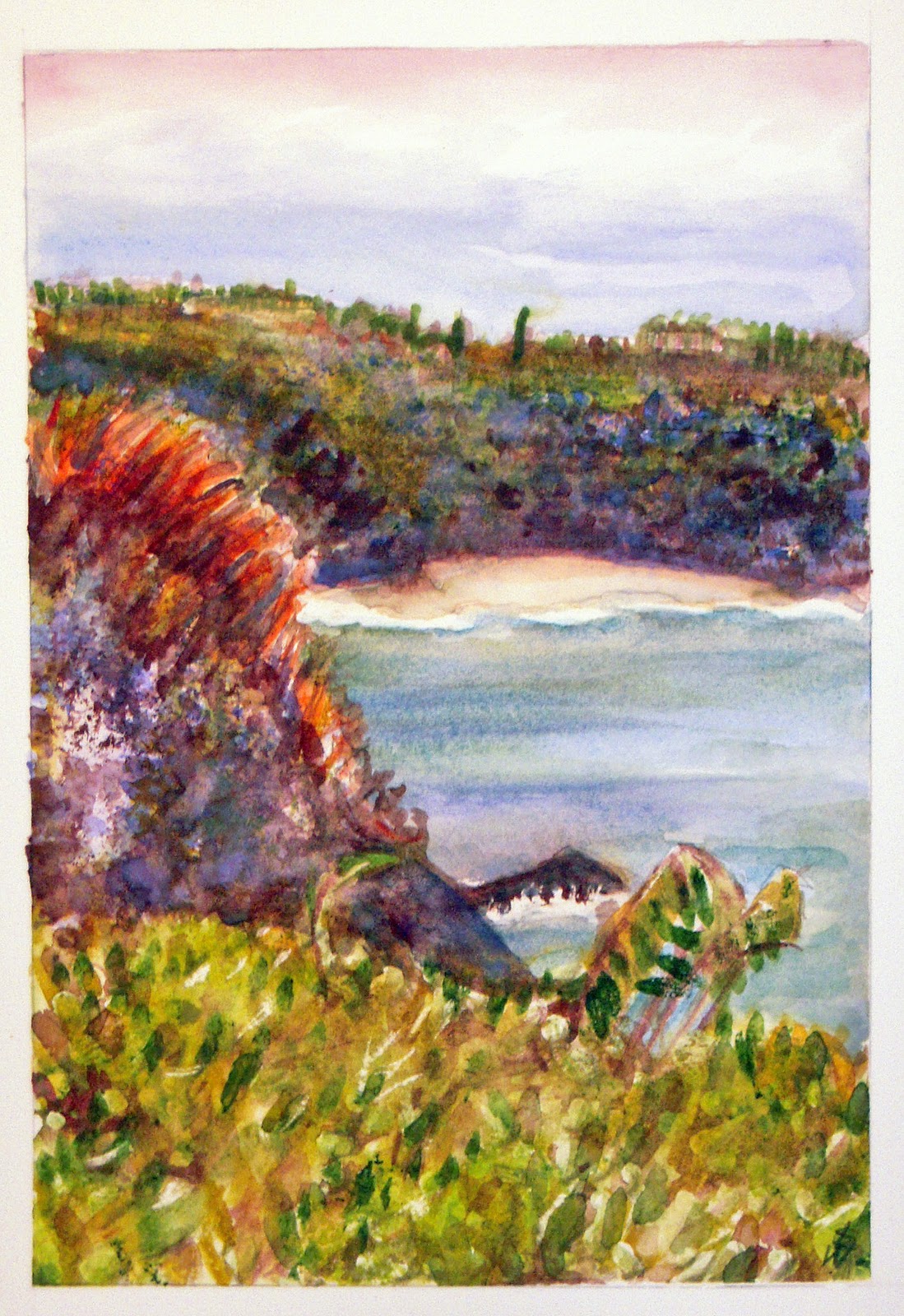 |
| “Kilauea Lighthouse Overlook, Kauai" Watercolor. 7" x 10" |
The piece was painted in a limited palette – a tetredic square of Yellow- Green, Red-Orange, Red-Violet, Cyan. (I also used a touch of Quinacridone Gold to glaze some of the foreground foliage left side – but so little I don’t think it unbalanced the color square.) I used several shades from each color category with Yellow-Green being the dominant color. I feel this provided a harmonious mix of colors. I’m pleased by how the colors are a bit warmer and “more tropical” than they were in the photo I used as reference. They are more accurate to my memories of the place.
As a Post Script to this posting. I’ve made a few technical corrections to my 11/13/10 post “Great Workshop at Daniel Smith's.” Apologies for the slightly incorrect Polychromos product descriptions. All should be corrected now.
Saturday, November 13, 2010
Great Workshop at Daniel Smith's
Yesterday afternoon I headed to Daniel Smith’s in Seattle for a free workshop given by Chicago artist/illustrator Don Colley. This workshop was sponsored by Faber-Castell and explored the characteristics of a variety of Faber-Castell products including Pitt Artist Pens, Albrecht Durer watercolor pencils, Polychromos colored pencils, and pastels for use in multi-media art pieces.
Don Colley is a wonderful speaker and a fabulous artist. His urban sketches created on huge, old, ledger books are truly a wonderful and very characteristic art. His manner was bright and lively as he described the products he uses in his art and illustration work.
Two of the media I use frequently in my artwork are colored pencils and pen & ink. After so many years of use, I had stopped asking a lot of product questions about either tool. I have used Prismacolor pencils for more than 20 years and have been satisfied with them for the most part. As far as ink pens go, I definitely have my favorites, with the Pitt Superfine (S) black pen being among them. I have also used the Pitt artist brush pens on a limited basis, with my primary use being calligraphy. I have been delighted with the Albrecht Durer watercolor pencils and have a large set of them. My painting “Please May I Come Up,” is done in the AD watercolor pencils.
With all that said, I was surprised and delighted to learn some amazing new things at the workshop yesterday.
Pitt Artist Pens:

Here’s are result. Perfect matches for color between the Polychromos and the AD watercolor pencils and a close match with the similar (but not exact number) Pitt brush pen. A success! I may now have to invest in a line of the Polychromos colored pencils since I won’t be able to mix and match them with my old Prismacolors. That would be oil and water! (or at least oil and wax – not a good match…)
Many thanks to DS blogger Deborah Burns for the timely heads’ up about this great workshop. A super afternoon event at Daniel Smith’s!
Don Colley is a wonderful speaker and a fabulous artist. His urban sketches created on huge, old, ledger books are truly a wonderful and very characteristic art. His manner was bright and lively as he described the products he uses in his art and illustration work.
Two of the media I use frequently in my artwork are colored pencils and pen & ink. After so many years of use, I had stopped asking a lot of product questions about either tool. I have used Prismacolor pencils for more than 20 years and have been satisfied with them for the most part. As far as ink pens go, I definitely have my favorites, with the Pitt Superfine (S) black pen being among them. I have also used the Pitt artist brush pens on a limited basis, with my primary use being calligraphy. I have been delighted with the Albrecht Durer watercolor pencils and have a large set of them. My painting “Please May I Come Up,” is done in the AD watercolor pencils.
With all that said, I was surprised and delighted to learn some amazing new things at the workshop yesterday.
Pitt Artist Pens:
- Are just pigment and water and therefore have no odor like other markers. (I had not paid attention to this before but now that you mention it…)
- Will set up and be permanent and waterproof but can be smudged immediately after they’re laid down.
- Are transparent and can be built up in layers like other wet media.
- DO NOT BLEED THROUGH PAPER!
- Are bound in oil (not wax as are Prismacolors) and so will not “bloom” when laid down in heavy concentrations of color. Waxy bloom is observed as a white sheen that can make a piece look dull and opaque. As I use heavy concentrations of color in my colored pencil pieces, not having to worry about waxy bloom building up is a huge revelation for me!
- According to the Faber-Castell website the color leads are 3.8mm, break-resistant, water-resistant, and smudge-proof. The Polychromos leads are glued down the entire (inside) length of the pencil casing thereby creating a stronger pencil overall.
- All the Faber-Castell products (pens, colored pencils, watercolor pencils, pastels) are color-indexed and each same-numbered color will be consistent across the entire product line.

Many thanks to DS blogger Deborah Burns for the timely heads’ up about this great workshop. A super afternoon event at Daniel Smith’s!
Tuesday, October 12, 2010
Puka Dog
While on Kauai we were recommended to a gourmet hot dog joint near where we were staying in Poipu. It’s called “Puka Dog” and is something of a local institution.
Normally, I’m not one for hot dogs but this place was special. If you can believe it, my tropical hot dog was a polish sausage (they have meatless too) served with spicy jalapeño garlic lemon sauce, mango relish, and Lillikoi (passion fruit) mustard on a bun. As my Dad would say, it was delish! In fact, we liked the place so much that we ate there twice during our five-day stay. :-)
Here’s my on-site sketch of Puka Dog and the marker drawing I did after I got back. I had to do this sketch in markers as the actual place was so bright and tropical.
Normally, I’m not one for hot dogs but this place was special. If you can believe it, my tropical hot dog was a polish sausage (they have meatless too) served with spicy jalapeño garlic lemon sauce, mango relish, and Lillikoi (passion fruit) mustard on a bun. As my Dad would say, it was delish! In fact, we liked the place so much that we ate there twice during our five-day stay. :-)
Here’s my on-site sketch of Puka Dog and the marker drawing I did after I got back. I had to do this sketch in markers as the actual place was so bright and tropical.
 |
| Fast sketch of Puka Dog Hawaiian Hot Dogs |
 |
| Marker drawing from pencil sketch |
A big thanks to Haley and Amy for being such great company during our visit! Also to Amy for her great snorkeling recommendations. Mahalo Amy!
 |
| Mahalo Amy! |

Subscribe to:
Posts (Atom)