French illustrator Edmund Dulac (1882 –1953) was a well known for his rich and detailed children’s book illustrations. One of my favorite things about Dulac is his use of color. Many of his watercolor illustrations show scenes in low light (night, twilight, or perhaps indoor scenes) but with bright flashes of color somewhere in the scene. He seemed to prefer cool colors for his palette, using only a limited number of warm colors for emphasis. (See how the scarlet stands out in the illustration below.)
 |
| Edmund Dulac illustration from "The Rubaiyat of Omar Khayyam" |
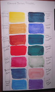
I thought it might be fun to hypothesize on which watercolor paints I have
right now that could be used to reproduce the colors in
his paintings.
Here’s the list that I came up with:
Winsor yellow (WN - Winsor Newton), Lemon Yellow (DS - Daniel
Smith), French Ochre (DS), Quin. Burnt Orange (DS), Scarlett Lake (WN),
Alizarin Crimson (DS), Rose Madder Genuine (DS), Prussian Blue (DS), Mayan Blue
Dark (DS), Cobalt Blue (DS), Manganese Blue Hue (DS), Ultramarine Turquoise
(DS), Phthalo Green (DS), and Bohemian Green Earth (DS).
 |
| Edmund Dulac "The Queen of Sheba" |
As seen in the above
illustration, Dulac also occasionally uses a very bright, cool blue-violet in
his paintings to wonderful affect. You can see how lovely this color looks when
placed next to the scarlet. Although I think I could mix this color using
Prussian Blue and Alizarin Crimson, it might be easier to just add Cobalt Blue
Violet (DS) to my palette instead. (Cobalt Blue Violet is about the same brightness
and temperature as the violet-blue he was using.)
Although I’m certain Dulac did not have all of these particular colors in his palette (Mayan Blue Dark being a new Daniel Smith color for instance), I think I can get pretty close using the colors I've outlined here. We’ll see!
UPDATE:
 |
| My version of the Dulac palette |

How did this work out? I can't suss what his palette was but I really would love to figure this out. Did you post any of your test pieces?
ReplyDeleteIt worked well. Since this blog was posted I've continued to study the palettes of pre-WWII illustrators. I have since discovered that Dulac's color choices were pretty standard for his time. Cool versions of yellow & red-orange along with Phthalo Blue over inked lines was probably what he used in "The Queen of Sheba" piece above. The greys you see are complimentary mixtures. Cheers!
Delete