Friday, January 18, 2013

Still on silhouettes but currently looking for a change

My watercolor exercises are proceeding nicely. As I’ve been working on essentially the same subject for the past few weeks now – sunrise or sunset colored skies with foreground objects in silhouette - I've decided it's now time to move on to some other exercises. Although I've still got tons of good exercises left to do in my current watercolor book, I also have a few new watercolor books waiting for me at the library (including some by watercolorist David Bellamy!!!) that have me pretty excited.

I’ve chosen to use two spiral-bound Stillman and Birn Delta sketchbooks (9”x12” and 6”x7”) for this series of painting exercises. By keeping my paintings in bound books I’m finding it much easier to keep track of any sequential improvements to my painting. It's also kind of like keeping a watercolor painting journal that will be fun to refere back to later one. ;-)

Here are my most recent paintings.

"Peaceful Evening," watercolor 6"x7"
"Willow Weeps at Night," watercolor 9"x12"


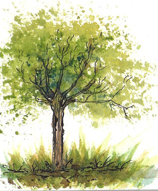
This last painting is a little bit different. I missed pen and ink and one night started doodling a tree. I've been experimenting with brush marks and had some fun adding color to my little drawing after the ink was dry.  

"Tree," pen and ink and watercolor
(This last one is just because I like trees.)

Tuesday, January 15, 2013

Been in Maryland for the past few days

I just returned from a very busy trip to the East Coast assisting my aging father with a house move. The trip was a lot of work but in between sorting, packing, and other errands, I was able to get in a little bit of sketching. Here are some of the sketches I did while on the trip, all done in graphite and black Prismacolor pencil in a gridded ledger.

This is "Chaz." He belongs to my Dad's best friend, Myron.

This East Indian sculpture is of Brahma riding his peacock.

These sketches were done in the waiting room of the
VA hospital in Baltimore. The man on the right was a
lovely priest by the name of "Angel."
P.S. I ran into watercolorist Susie Short at Daniel Smith's in Bellevue a few short (no pun intended) hours before leaving for Maryland. Susie was kind enough to show me some watercolor tricks for smoothing out my washes in the few minutes I spent with her. Now that I'm back I'm looking forward to trying out her suggestions in my next watercolor piece. Thanks Susie! :-)

Tuesday, January 8, 2013

While waiting for my haircut appointment

Not unexpectedly, it was raining in Seattle today when I arrived for my haircut appointment. I was a few minutes early and decided to spend the extra time sketching in the car before going into the salon. I'd brought my little pencil sketch kit with me today, it's very easy to carry in my purse and works well in wet weather.

"Outside Brown Hair" - graphite in a ruled journal
Graphite sketch kit
The picture above shows what I've got in my graphite sketching kit (from left to right): Lyra 9B
water-soluble graphite crayon, General's sketching pencil, 6" ruler, white eraser, 2 Prismacolor colored pencils - steel & black, 2 Design Ebony pencils, 2 2B graphite pencils, stump, Pentalic woodless pencil (I think it's a 2B), and a sharpener. It's all fits very well into a Nomadic PE-06 Side Zipper Pencil Case.

Thursday, January 3, 2013

Bright Sunset

“Bright Sunset,” © Sara Light-Waller
7.5” x 10.5” watercolor in a Stillman & Birn Delta sketchbook.
Here is my most recent watercolor painting, “Bright Sunset,” an exploration of graded-color washes applied in slow glazes. I took my time with this painting, waiting until each wash was quite dry before applying the next one. This slow application of color allowed me to get the washes quite bright and fairly smooth, just the ticket for this particular piece. I’m pretty happy with this painting, feeling that it shows a definite improvement in technique over my last two pieces. My only complaint comes from the masking fluid I used to mask out the sun. It proved rather hard on the paper surface as you can plainly see in the top left portion of the sun. Ah well, onwards and upwards!

P.S. The new palette colors are working beautifully for me.

Monday, December 31, 2012

Concept Art in Watercolor

"The Lonely Tower"
© Sara Light-Waller, 2012
Some of the watercolor paintings I'm doing right now are also serving as concept art for my book. Although I'm not planning on illustrating the book as such, I am planning on doing some spot illustrations for it.

In this painting a strange, half-abandoned tower in seen the frigid wastelands of the north. My thought is that it's an abandoned alien lightning tower from about thirty years ago. Times have changed and technology advances, but such relics can still be found on conquered Earth. Perhaps my heroine chanced upon this place during one of her long hunting trips in the wilds of Alaska. If she did, she would have given it a wide berth, wanting nothing to do with Ciodali things, at least before the book begins....

Sunday, December 30, 2012

New Watercolor Palette


As I'm considering doing a watercolor painting for my novel cover, I've taken stock and realized that my watercolor skills are a bit stiff and rusty. Horrors! I have several books on my shelf with watercolor painting practice exercises in them  and I've decided to get on with it and start practicing. As I began, I realized right away that I didn’t have a palette made up with many of the “standard” colors being suggested for the exercises. The palette I'd been using has some lovely colors in it, but many are non-standard mixed colors that weren’t reacting as the exercises had led me to expect.

Last night at about 10 pm, I cleaned out an old palette and prepared a new one, a hybrid of tube paints and some partial DS watercolor sticks. I had to do it this way as I only have some of the colors I needed, like Alizarin Crimson, in stick form.

For those who might be interested, here’s a picture of my new palette, with the names of the colors listed beneath. (NB: all are Daniel Smith watercolors except for the Davy’s Gray which is Winsor Newton.)

Lemon Yellow, New Gamboge, Nickel Azo, Cadmium Yellow Deep Hue,
Yellow Ochre, Cadmium Orange Hue, Cadmium Red Medium Hue,
Cobalt Blue Violet, Permanent Alizarin Crimson, Venetian Red,
Fired Gold Ochre, Burnt Umber, Sepia, Payne’s Gray, Davy’s Gray,
French Ultramarine, Indanthrone Blue, Mayan Blue Genuine,
Cerulean Blue, Cascade Green, Sap Green,
Rich Green Gold,
and White Gouache.
I also added a few “extra” colors to play with: Lapis Lazuli Genuine (24), Rose Madder Genuine (25), and Natural Sleeping Beauty Turquoise (26).

As a note of these three last colors, they are all kind of problematic and I’ve really put them in here just for fun. Rose Madder Genuine is one of my favorite mixing colors, producing some of the best neutrals I have ever seen when mixed with a clean yellow and a clean blue. However, the downside is that it's a highly fugitive color with almost no lightfastness. So, unfortunately, it’ll fade in light quite quickly. I've tried before to replace it in my palette with Potter's Pink, which is much more lightfast, but I just don't like it nearly as much as a mixing color.

Lapis Lazuli Genuine is new color to me, a very delicate cool blue, perhaps too delicate to be of any real use, we’ll see. It may work well as a tint for cool white objects or snow, so that's probably where I'll try it at first.

New palette and color key
I’ve tried several times to use Natural Sleeping Beauty Turquoise in palettes and never end up using it. I’m not sure why. When looking for a Turquoise I tend to reach for either Ultramarine or Phthalo Turquoise before this one. But as the Sleeping Beauty is a very clean, transparent Turquoise it will likely create some harmonious neutrals when mixed with Alizarin Crimson…so I’m hopeful I can put it to some good use in this palette.