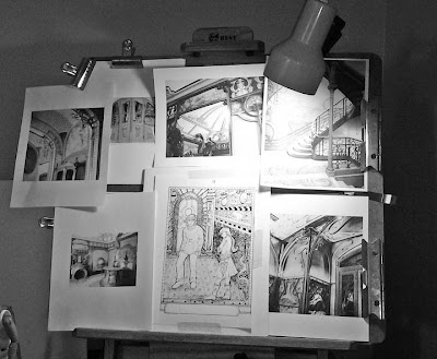
Here’s a look at my drawing board tonight.
 |
| Contrast studies to make "color." |
At the moment I’m trying to create just the right level of
contrast in my newest drawing. My inspirations for this illustration are the beautiful details in Art Nouveau design. There are a lot
of midtones in Art Nouveau colors and that can prove a bit challenging in pen & ink. But, not
impossible. By studying the high contrast black and white photos I've posted around my drawing (thank you,
Photoshop), I should be able to get pretty close to what I want in the illustration…at
least I hope so.
 |
| For me this is the best way to get the contrast where I want it. |
I’d say the illustration is about half done at this point. Drawings always look kind of messy at this stage but this will change as the
contrast comes up. Although pen & ink drawing is a very fluid process for
me, sometimes I find it’s wise to pause and contemplate your path, especially when the
piece is complex, as this one is. That pause can be just the thing to make sure you’re
going in the right direction.

No comments:
Post a Comment