Showing posts with label Technique files. Show all posts

Saturday, July 19, 2014

The Diversity of Color: Analogous Trinities


As my understanding of color grows, I begin by understand that there are nearly infinite ways to use color in painting, if you understand how the vibration of color works with its analogous or complementary color on the color wheel. That is the point of the following exercises — to use three analogous colors, mixed with their complements, but keeping to either the warm or cool side of the color wheel. Fascinating effects, don’t you think? In each painting study, one section is painted in colorful neutrals, while the other side leans towards pure color. When you place pure color next to neutralized color, the pure color looks more intense. While the neutralized color changes slightly, highlighting the complement within the neutral.

Color chart of three analogous cool
colors with neutral mixtures.
"Blue Arizona"is painted with a neutralized sky and pure color mountains. The effect, for me, highlights the neutral sky. The only colors I used in the painting are the colors swatches seen in the color chart above.

"Blue Arizona," watercolor, 11" x 14"
Copyright, Sara Light Waller, 2014

Next, we flip over to the warm side of the color chart.


Color chart of three analogous warm
colors with neutral mixtures.

"Grand Canyon Sunset" is painted with the colors swatches seen in the above chart.

"Grand Canyon Sunset,"watercolor, 9 3/4" x 15" Copyright, Sara Light Waller, 2014
As you can see, the two paintings are vastly different! And all from using only six colors, staying to cool or warm side of the color chart, and using the main three colors' complements to create colorful neutrals. What a fun ride! :-)

Wednesday, April 25, 2012

Delay in Horse Life leads to doodling

"It's been a long week!"

For the past week I having been working hard to finish up some commissioned illustrations. Of course, this required me to put all non-paid art on temporary hold. Hence the lack of appearance of Horse Life this week. It will be back, and soon, but not for a few more days.

Last night, in a late night stupor of being awake but not able to do any more “official” artwork,” I started doodling notes for future Horse Life comics. Truly, it’s a case of too much information! I have anecdotes that could keep me busy for years! *chuckle* I am also working on finding my stride as far as the characterizations for the comic. Studying established and popular cartoonists like Norman Thelwell and Charles M. Schulz, (creator of “Peanuts”) is both enlightening and helpful. As I sketch, I learn and process. Eventually, I will find my own stride, just as they did.

In that spirit, here are three of my pony sketches from last night when everything seemed “up in the air!.” ;-)
"Reaching new heights"
"The Star Player"
"Putting on Airs"

Monday, October 3, 2011

Back to painting

Now that the coloring book is officially launched(!!!) I get back to painting while I promote it. For my newest piece I have returned to the world of Inktense/Neocolor II painting. This will be my second piece in these media, the first being my “Chickadee” which I finished over the Summer.

“Chickadee” was painted on Aquabord which I found to be quite a nice "toothy” surface to work with. For this piece (which has a working title of "Percy 2") I have treated a 12" x 16" piece of canvas board with Daniel Smith’s watercolor ground and am trying that out as a surface. So far so good, I think…but we’ll see how it holds up for the finished piece.

Here is the palette I have chosen.

Derwent Inktense pencils for the under painting: Fuchsia, Leaf Green, Beech Green, Oak, Sepia Ink, Bark, Willow, Saddle Brown.

Caran d'Ache Neocolor II for the over painting: White, Salmon, Pink, Mauve, Light Blue, Light Olive, Moss Green, Venetian Red, English Red, Cinnamon, Burnt Sienna, Sepia, Ochre, Light Ochre, Orangish Yellow, Light Beige, Mouse Grey, Dark Grey, Greyish Black, Payne’s Grey.

My palette

1. Here's the progress thus far. We start with the line drawing.

"Percy 2" part 1

2. Then add Inktense (still dry) to start the under painting.

"Percy 2" part 2

3. Here is the Inktense wet with brush and q-tip.


Now that it's officially on it's way, please check back and follow this piece's journey along with me. :-)

Thursday, July 28, 2011

Step-by-Step Inktense/Neocolor II Painting: “Chickadee”

One of my readers asked me to do a more in-depth description of the process I used to create my latest painting "Chickadee" in Inktense pencils and Neocolor II crayons. I hope that by sharing my process here I will encourage others to try out this fun technique too!

Picking tools
I have been fascinated by Inktense pencils since I first heard about them. I have been most pleased to see how well these ink pencils integrate seamlessly into ink artwork. Unfortunately, some of the Inktense colors aren’t very lightfast and to avoid fading I decided to choose the colors for my piece based on lightfastness ratings of 6 and above (on a scale of 1-8, 8 being the most lightfast.)

I have been taking an interest in water-soluble pencils and crayons recently and was curious to try using the Caran D’ache Neocolor II crayons in a fine art piece.

On one of my trips to Dick Blick's a while ago I picked up a small piece (8” x 8”) of Aquabord to experiment with. I liked the idea of using it here as the surface is rather rough and I thought it would work well to show the roughness of the tree bark in my picture.

Picking a palette
In starting a new piece my first step is always to choose a palette. Although I may add additional colors later on, I think it's best to do some planning before you start. Flying blind with color can lead to some awkward color passages and disharmonies later on.

I use hole-punched pieces of white watercolor paper (nice and heavy) to match little pieces of color in my reference photo with the Inktense and Neocolor II swatches in my swatch book.

Once the palette is chosen I'm ready to start the piece. Here is a look at my workspace with palette swatches, brushes, a sponge, and q-tips for applying and softening color, pencil sharpener, Inktense pencils (in cup), mechanical pencil, and some of my Neocolor II crayons laid out and ready to go.

Here is the reference photo I chose to work with in this piece.
I used graphite transfer paper to transfer the basic image shapes to the Aquabord.

The Painting
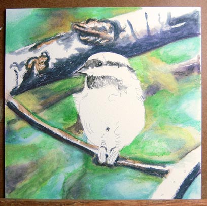
To begin the painting I laid down color with Inktense pencils to create the out-of-focus background. After applying the color I smoothed it with q-tips wet with a moderate amount of water. The Inktense pencils create very bright colors that will be enhanced and softened by Neocolor crayons later on.

Here is the Chickadee with Neocolor II crayons added over the Inktense pencils in the background. Fairly opaque in nature, they helped create more variation and richness to the background as a whole. At this stage the background is nearly complete.

Next I began working on the darkest darks in the tree branches in the middle ground with Inktense pencils. I have also colored the bird’s eye for tonal reference. The eye will remain the darkest dark in the entire piece.

I have developed the branches a bit farther here and added a tiny bit of work on the bird itself. At this stage the colors you see in the middle and foreground are still in Inktense only. I have not yet started adding the Neocolor crayons to the branches.

Here we see the main branch completed after adding several layers of Neocolor II crayons. I have also started adding Neocolor to the other branches.

With more detail (Neocolor II) added to the other two major branches and a bit of color (Inktense) added to the bird, the painting is beginning to come together.

The piece is almost done now. Just the final details and some smoothing of the color is left to do. At this stage I like to leave the piece for a few days so that I can contemplate what still needs to be done after a break. Sometimes, I’ll turn the painting upside-down and look at it next to the reference photo (also upside-down) to see if the shapes and colors are matching well. Turning a piece upside-down can help remove your ego from your thought process and simply analyze the shapes and colors for accuracy.

Chickadee 8" x  8"
Neocolor II crayons and Inktense pencils on Aquabord
Well, here it is! The finished Chickadee painting. I am most pleased by how this new medium worked out for me. It was satisfying in both a tactile and a visual way. High marks for enjoyment!

Here are some close-up images from the painting: 

Close-up of the main branch

Close-up of the bird
I hope that this tutorial has been helpful and even inspiring. Creating this painting has certainly been the most fun I’ve had using crayons since the second grade! Why not try this technique yourself? If you do, I'd love to hear from you. And don't forget to send me a link too so I can see what you've created! If you liked seeing my step-by-step process here please let me know and I'll post more how-to's in this style in the future. :-)

Friday, July 22, 2011

Who says a crayon can't be used to create art? Chickadee finale

Chickadee 8"x 8"
Neocolor II crayons and Inktense pencils on Aquabord
Well, here it is! The Chickadee painting. I am most pleased by how this new medium worked out for me. It was satisfying in both a tactile and a visual way. High marks for enjoyment! I am looking forward to trying some other subjects in this style. I have a really good feeling about it. :-)

Here is the entire sequence of the piece from start to finish.

Cheers!

Thursday, July 21, 2011

Wednesday, July 20, 2011

Chickadee Part 5


With more detail (Neocolor II) added to the other two major branches and a bit of color (Inktense) added to the bird, the painting is beginning to come together. I am really enjoying the play of Neocolor II crayons on the rough texture of the Aquabord. Together, they create a really nice, textural, harmony. :-)

Monday, July 18, 2011

Chickadee Part 4


The main branch is now looking much more complete after adding several layers of Neocolor II crayons. The Neocolor crayons are really lovely to work with, very tactile as only crayons (or maybe oil pastels) can be. For me this makes the layering process quite enjoyable!

Now to get working on the bird herself... ;-)

Friday, July 15, 2011

Chickadee Part 3

Here is the chickadee today with more development on the branches and a tiny bit of work on the bird itself. At this stage the colors you see in the middle and foreground are still the Inktense base. I have not yet started adding the Neocolor crayons. I will deliberately leave the bird's eye in Inktense only as I like the shininess of it.

Thursday, July 14, 2011

Chickadee Part 2


Here is the Chickadee with the background mostly completed. Since the last update, I've added Neocolor II crayons over the Inktense pencils in the background. This created more variation in color and a bit more richness to background as a whole.

At this point, I have just started working on the tree branches in the middle ground with Inktense pencils.

Wednesday, July 13, 2011

Yes, you can use q-tips and crayons for fine art! Chickadee Painting

I have recently started a new piece in Inktense pencils and Caran D’ache Neocolor II water-soluble crayons. What a delight! I took my cue from Mona Majorowicz and her Squidoo lenses about using Inktense with Neocolor II crayons in her wonderful animal paintings.

I simply had to give it a try! Although Mona frequently uses Suede Board as the support for her paintings, I decided to use Aquabord for my test piece. The Aquabord surface is quite rough and I felt this would be appropriate for the woody subject I had chosen.


In starting the piece the first step was to choose my palette. I used hole-punched pieces of white watercolor paper (nice and heavy) to match little pieces of color in my reference photo with the Inktense and Neocolor II swatches in my swatch book.


After choosing my palette, next I assembled my tools. Here is a picture of all the pieces laid out. And yes, those are q-tips. I quickly discovered that they were the best choice to smooth the Neocolor II crayons. Brushes work too but dilute the effect of the opaque crayons. On the rough surface, the crayons have been giving me really wonderful textural effects.


Here is stage one of the painting with the background laid in, mostly in Inktense pencils. The brightness of the Inktense provided a wonderful base for the Neocolor II crayons.

Please come by again and watch how the painting progresses. :-)
Saturday, June 25, 2011

Drawing With Pen & Ink - Part 3


The Unique Qualities of Pen Drawings

Pen and ink has some distinctive features. The first is the pen itself. Unlike a pencil or crayon, the pen gives off no color or tone by itself. You have to add ink. The pen point is pretty fine, so, unless you have a brush to deliver it, ink is laid down only a little at a time. Covering large areas with ink produced from a single fine delivery point becomes impractical. For this reason, pen & ink pieces are generally smaller than other artwork mediums like watercolor.

Wildly varying values that exactly mimic nature tend to be difficult to create in pen & ink. For this reason a lot of mental editing is required by the artist. Much information may need to be left out or simply implied in order to create a pleasing piece that makes sense to the viewer’s eyes.

Tonal values are frequently under-used or even disregarded in pen drawings. The lack of values are replaced by the use of outline. No other art technique uses the outline the way pen drawings do. The use of the outline, along with the particular method of tone building using lines and dots to build up “color” are two of the distinctive characteristics of pen drawings.

Lovely Lines

The suggestive nature of good line work leaves much to our imaginations. The crispness and directness of pen drawings make them full of light and life. The very expressiveness of the lines themselves can become the focal point of the piece.

It is the graceful suggestion of form and shape through line work that makes pen drawings so effective. They are at once restful and graceful to the eye. As the beginning pen and ink artist learns quickly, it takes practice to see and understand what to leave out and what values to reverse in order to suggest a shape in a pen drawing. These are necessary steps in creating an effective image. Like any skill, it takes practice. But like most skills, it is well worth practicing. :-)

"Canterbury Tails Pencil Knight," copyright Sara Light-Waller 2011

Monday, June 20, 2011

Drawing With Pen & Ink - Part 2: Line vs. Tone Artwork


In this article I want to share some of the concepts from a classic pen and ink book by Arthur Guptill called, “Drawing with Pen & Ink.” (This book is out of print but I believe it has been reprinted as “Rendering in Pen and Ink: The Classic Book On Pen and Ink Techniques for Artists, Illustrators, Architects, and Designers,” written by Arthur L. Guptill  and edited by Susan E. Meyer.

Line and Tone Artwork
According to Guptill, pen drawing as a separate and complete art form is comparatively recent, only appearing in the last quarter of the 19th Century. The pen was, of course, used in art much earlier, you have only to look at the illuminations of the Middle Ages or the studies of various old masters to see that. What Guptill is describing are pen drawings as pieces of fine art in their own right, not as adjuncts to calligraphy or as parts of preliminary studies for later finished paintings.

Photomechanical reproduction techniques played a large role in the popularity of pen drawing as a separate and distinct art form. Before the advent of computers, scanners, and digital separation techniques, artwork for reproduction was divided into two basic categories: “line” and “tone” artwork. Color artwork that needed to be separated into several colors for printing was “tone.” Graphite pencil, as well as other techniques using graded shades of gray or color, were also considered “tone.”

"Rose Horse," mixed media, an example of a "tone" drawing. (copyright Sara Light-Waller, 2011)

Pen drawings made up of black lines or dots were considered “line” artwork for the purposes of reproduction. Line artwork was easier to reproduce. There was little needed in the way of proofing by artists and printers. It was either too light, too dark, or just right.

Although a complex pen drawing may look like it has many shades of grey within it, it is still, strictly speaking, only black and white. The skillful use of shading with lines or dots is what makes black and white “line” artwork appear to look like graded “tone.”

"Armored Horse," pen, an example of "line" artwork. (Copyright Sara Light-Waller, 2011)

Nowadays, with digital reproduction techniques, all of these old forms are no longer important. What remains important is to understand why pen & ink became so popular in the late 19th and 20th centuries. Simply put, it was cheaper and easier reproduce. It also usually reproduced well. What about that isn’t good?

Next up in Part 3The Unique Qualities of Pen Drawings

Tuesday, June 7, 2011

Drawing With Pen & Ink - Part 1

"Jack" - pen & ink rendering done in a tight style.
Pen and Ink is one of my favorite mediums of expression. The feeling of quietly adding marks to a paper is very relaxing for me and always has been. Of course, this doesn’t apply when you’re in a hurry, but if you can get “into the zone,” you’ve got it made.

Many people have asked me over the years how I can work in a medium that really is quite unforgiving. Although there are ways to make corrections, by and large, pen and ink is a not an-easily-correctable medium. So how do I keep my stress levels down while working with it? Practice with a pen, first and foremost. Planning with a pencil before applying ink. Finally, a determined mindset that doesn’t allow space to think about my lines being wrong. If they are, well then, I correct them. If a piece goes too disastrously wrong, I start again. In that way it’s similar to watercolor. Planning can make a big difference in any medium that isn’t easy to correct.

For pen and ink work practicing “your hand” is very important. In other words training your hand and arm motions to be consistent. Having been trained as a draughtsman in the old school (pre-AutoCAD) I learned how to make pretty straight lines without a ruler and to make all sorts of other consistent and repeatable marks as well. This is so true today that my scrawly signature looks the same EVERY time. This is because I can copy the same hand and arm motions each time. Piece of cake really! I continue to practice making marks whenever I think of it. Buying my new Noodler's pen was a wonderful opportunity to catch up on my practicing last night.
Pen & ink practice exercises
Pen and ink illustration today (not cartooning which has always been stylized) is, by and large, pretty tight. That is to say, the popular rendering styles of the current day tend to be highly accurate and photographic. This wasn’t always the case. Classic pen and ink styles have also included looser and more stylized drawings, as were common in the 1950’s and 1960’s.

As an example here are two pen and ink drawings by well-known artists. The first one is by Henry Pitz from the mid-20th Century and the second is by Claudia Nice from the late 20th. Similar subjects but handled quite differently. Which do you like best?
By Henry Pitz
By Claudia Nice
In Part 2 of this article I’ll talk about a classic pen & ink book and some of the history of the field.

Tuesday, February 15, 2011

Long time, no post

Oh my, it's been a long time since I've posted anything here! Today I thought it about time to let folks know what I've been up to. First off, I've been working on a large colored pencil commission of two Pointers. For each commission, I provide my client with a personal, secret webpage on my site where they can watch the progress of their portrait. It's proved a very popular feature that gives a client a lot of peace of mind about their portrait. :-) When the portrait is done and delivered, and with the client's permission, I'll post it here. ;-)

I've been playing around with Distress Inks and are finding them delightful. I've made a bunch of freebie promotional  bookmarks and have been experimenting with card and tags. I love the look of distressed paper and am considering some new options for a line of Etsy cards combining distressed paper, collage, and my artwork. Pretty fun!

My distress ink samples


Promotional bookmarks

Finally, after MANY, MANY years I have gotten myself a proper photographic set-up for small product photography. WHAT A RELIEF!!! The photos above were taken in a tent with a black sweep behind them and tra la! I AM SO HAPPY!! Back in the day, I was pretty good at both product and studio portrait photography. It's really nice resurrecting some very old skills. ;-)