Showing posts with label portrait. Show all posts

Tuesday, December 27, 2016

Tunisian Girl - Work in Progress


"A Tunisian Girl," colored pencils WIP digital effects
This is the piece I have on my drawing board right now. Her inspiration is a photo from the late 19th or early 20th centuries. The image is from a glass plate negative, I think. I have no idea who she was, but I’m calling her “A Tunisian Girl” for lack of a better title. My medium is colored pencils on medium-toned Canson paper. I’m using a limited palette, just a few colors, to give the final piece the soft, faded look.

A long time ago I worked in a darkroom as a photo-restorer. (This was well before Photoshop.) We made prints, bleached them, bathed them in various tints, hand-colored them...the works! Sometimes, I miss those old days of restoring horrible, old prints found in some shoe box in an attic. 

Today, it's easy to take a piece of artwork and make it look old. That's what I've done here. Just for fun, I’ve added old-timey digital photo effects to my half-finished portrait. 

I'll post the final piece when she's finished.

Wednesday, June 11, 2014

My newest commission was delivered today

A very happy client
My newest portrait, a surprise birthday present, was received today by its new owner. The subject was Ryker, a very dear Belgium Treverian who passed away not too long ago.

With persmission, here is what the portrait’s new owner had to say:

“My daughter, Samantha, had this portrait of my Heart Dog, Ryker, made for me. Beautiful art work by Sara Light-Waller. She captured Ryker's very essence.” – Diane Garwood

"Ryker" by Sara Light-Waller
“Speaking of your amazing artistry.... I received my picture of Ryker that you drew. It is on my FB page. Although showing it on FB does not do it justice. As I opened the wrapping paper Cassie had put it in, and started to see what it was I was overcome by amazement. I started to cry and when I pulled out the whole picture I was sobbing!! You so totally and completely captured the love and very essence in his eyes. I honestly do not have the words to convey my gratitude for Samantha commissioning it and for the obvious love and care you put in to drawing it. Thank you Sara. Thank you from the very deepest part of my heart.”  Diane Garwood

Thank you Diane and Samantha for the commission and the joy I received from creating it for you.

Tuesday, February 4, 2014

Casein painting #3 – Portrait of an artist from 1744


"Portrait of an Artist from 1744," 9" x12", Casein
Sara Light-Waller, 2014

This is the third of my casein paintings. For this one I did an underpainting in watercolor, instead of in casein. This worked out much better. It allowed me to build less layers, and I had no trouble with the flaking paint this time. Lesson learned.

I’m finding myself using a much more painterly style for these casein paintings and this seems a good fit for me.

Along the way, I’ve added a few casein tips to my growing list.

Casein tip #6 — Don't panic, especially in the early stages of the painting. This refers specifically to building of skin tones. In the early stages, my skin tones have looked awful, green and ghastly. I took my time building opaque layers and fairly quickly, I began to get a normal skin tone. By the end, it all worked out okay.

Casein tip #7 — You really can't do without Burnt Sienna, at least when you're using full chroma.

Casein tip #8 — “They” are correct. Casein will stain a plastic palette. I’ll use a ceramic one, or a butcher tray from now on.

Saturday, February 1, 2014

Casein painting #2 – Portrait of an 18C Naval Officer


"Portrait of a Naval Officer," c. Sara Light-Waller, 2014

My second casein painting, done in a 9”x 12” Stillman and Birn Beta Sketchbook. I’m pleased with it and am really loving painting in casein. I feel like I’ve been painting with it for years already!

I have already made several discoveries about casein that are useful to know.

Casein tip # 1 — When painting in casein NEVER dip your brush into dirty water and then mix white. It took me several days to figure out why I was getting such muddy whites. Now, I'll dip my brush in clean water before I touch the white paint with it. It's making things much better, and brighter.

Casein tip #2 — When applied too heavily, casein will start to flake off the page. It's not oil paint!! I shall do my next painting with an underpainting in watercolor and see how that goes. It might provide a good base that will prevent any flaking later on.

Casein tip #3 — I was not happy with the underpainting I did on the face in yellow ochre. I thought, because the paint was opaque, ochre would provide a nice, warm skin tone. Instead, my fellow looked sallow and I had to reconsider the entire facial color scheme as I went along. I think it worked out alright in the end, but I know that I can do better. Again, next I’ll try an underpainting of watercolor and see how that does.

Casein tip #4 — Casein stays on your brushes. They need to be washed out with mild soap and water after each painting session.  

Casein tip #5 — Unlike watercolor, casein does not perform as well when re-wet, as it does fresh out of the tube. To try and save paint at the end of the day I’ve wet the remaining paint on my palette and covered it with plastic wrap for the night. I don’t know the results yet. I’ll let you know. I can’t stand wasting paint.

So that’s the update for today. Expect more soon, and a video showing my progress through the painting shown above.

Saturday, April 28, 2012

Rudy

You may be wondering about the point of all these little horse paintings in my journal lately. The reason is two-fold. The first is that I am bothered by my sketches being too sketchy! I wanted to work towards a more painterly and finished approach in my sketching. 

My current sketch kit - although I have now added two more pencils to it -
Turquoise and Indian Red Cretacolor woodless watercolor pencils.
The second is that I am working with a fairly limited palette in this sketch kit and am trying to get to know it better. I actually love this little kit. It’s small and handy and yet has all the colors I need. My sketchbook in this case is a Stillman and Birn Gamma. I am finding the Gamma quite delightful to use. Although it’s mainly for dry media it can take a light wash and, although the paper will cockle when wet, the page will flatten out again when dry. It can even tolerate a moderate amount of scrubbing.

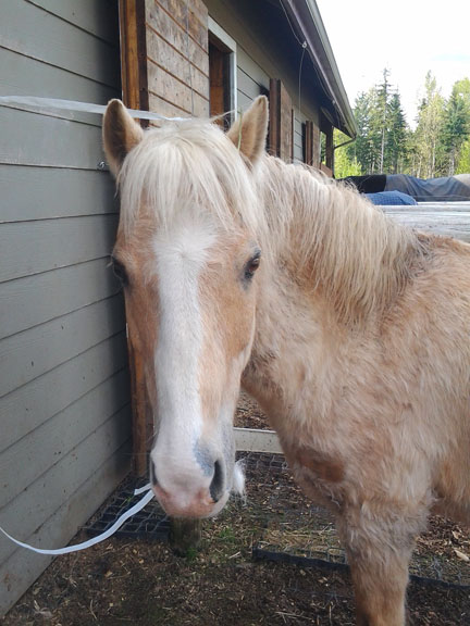
Yesterday I sketched “Rudy,” a Palomino pony at Brenda Jacroux’s farm. Rudy is currently a hairball and is going through a massive shedding cycle. Although in Summer he will be a bright golden color, right now he is a mixture of yellow, roany-pink, and muddy hair.

"Rudy" aka (affectionately) - "That Yellow Thing."
I wanted to try and capture his strange mixture of colors in this little watercolor painting. Although the scan didn’t pick it up, I laid in a light blue background behind Rudy to highlight the yellow in his coat.

"Rudy" sketch - watercolor pencils and Neocolor II
in a Stillman and Birn Gamma sketchbook.

Monday, March 21, 2011

Walker and Cocoa

"Walker & Cocoa" (16"x 20" Prismacolor pencils on Stonehenge paper)
I've been working on this portrait for a while but can finally show it off since I delivered it to my happy clients today. This is a portrait of Walker and Cocoa, two young German Short-Haired Pointers. They are brother and sister and as unlike as they could be. Walker (with the mottled coat) is a mellow male and Cocoa (mainly solid brown) is a very active female. They're each in training to be field hunting dogs and, as I understand it, Cocoa is a hunting star. Walker is good too, mind you, but Cocoa is fast and sharp-eyed. Girls take note, this little dog has it all over the big guys! ;-)

Saturday, February 26, 2011

Racing along…

I’m having a lot of fun with this piece. I love the feeling of the girls with their attention on their show pony. When I was younger my sister competed on the “A” Hunter circuit with a pony that looked a lot like this one. Her name was Plum Puddin’. When I look at this piece I smile and think of my sister and her pony.

“Champion” part 2

Tuesday, February 15, 2011

Long time, no post

Oh my, it's been a long time since I've posted anything here! Today I thought it about time to let folks know what I've been up to. First off, I've been working on a large colored pencil commission of two Pointers. For each commission, I provide my client with a personal, secret webpage on my site where they can watch the progress of their portrait. It's proved a very popular feature that gives a client a lot of peace of mind about their portrait. :-) When the portrait is done and delivered, and with the client's permission, I'll post it here. ;-)

I've been playing around with Distress Inks and are finding them delightful. I've made a bunch of freebie promotional  bookmarks and have been experimenting with card and tags. I love the look of distressed paper and am considering some new options for a line of Etsy cards combining distressed paper, collage, and my artwork. Pretty fun!

My distress ink samples


Promotional bookmarks

Finally, after MANY, MANY years I have gotten myself a proper photographic set-up for small product photography. WHAT A RELIEF!!! The photos above were taken in a tent with a black sweep behind them and tra la! I AM SO HAPPY!! Back in the day, I was pretty good at both product and studio portrait photography. It's really nice resurrecting some very old skills. ;-)

Friday, January 21, 2011

Colorful “Bradley”

"Bradley" 9" x 12" colored pencils on cold press watercolor paper.

“Bradley” is completed! What do you think? I’m not sure he’s my most successful piece, but he has been a great learning experience for me. Here's a link to the previous entries about this piece.

My goal for this piece was to start with a watercolor pencil base and add Polychromos colored pencils on the top. I started with an under painting as I would in a watercolor, using a complementary monochromatic color. I chose blue-violet. In watercolor, this would have worked to my satisfaction. With colored pencils, the yellows and ochres didn’t cover as well as I'd hoped and the piece ended up being a bit dark. On the other hand, the under painting did make the dog look quite solid, and that's a plus.

The cold press watercolor paper I used here was a new twist on a colored pencil surface for me. It felt unusual but ended up working well.

“Bradley” gives the impression of being a wheat-colored dog, more or less, despite being a little extra-colorful. Is he too colorful for a dog? I think like the result.

Next time I might try another approach to the under painting and work a bit harder at preserving my lights. That having been said, I give “Bradley” a conditional thumbs up.

Tuesday, January 11, 2011

On pencil marks and hair tracks

"Bradley" Stage 5

This piece is definitely providing me with some distinct challenges. Not because I haven’t created a portrait of a terrier before. On the contrary, I have done many portraits of terriers in colored pencils. But this pup is being done in oil, not waxy, colored pencils and they’re providing me with a completely different drawing experience. At many points in this piece’s creation, I have wanted to blend the pencils, as I would with my waxy Prismacolors. But the oil-based Polychromos, acting much more like hard graphite in some ways, do smudge but don’t blend.

In my pen and ink artwork I’m very used to drawing distinct hair tracks. In fact, I plan for it. But in colored pencil work I’m realizing that I expect a completely different effect. I’m finding that I’m using a needlessly heavy hand trying to get the oil-like painterly effects that I’m used to getting in my colored pencil pieces.

How frustrating! And humbling… This piece has shown me that either A., I really like my Prismacolors. I understand their use and feel comfortable using them. OR, B., that I have been complacent with my colored pencil technique for too long and it’s now time for a well-needed refresher course. I’m not sure which it is yet. What I do know is that being willing to continue on with a piece that you feel is sub-standard is sometimes necessary. Why? Because learning depends on it. Mistakes seem to provide the absolute height of embarrassment. But making them allows you to figure out where you are, and maybe, what you need to change. I will certainly finish this piece and, in all likelihood, it won’t be all that bad. But it is teaching me a lot and for that I am most grateful. ;-)

Sunday, January 9, 2011

More Bradley

"Bradley" Stage 4

"Bradley" continues today. At this point the color is beginning to overtake the under painting. What a relief! For a moment I had my doubts as to whether the non-waxy Polychromos pencils would do the job. I had to control myself and not reach for my usual Prismacolors.

Learning new techniques (like learning anything) takes courage and the willingness to make mistakes. When trying out something new, I always have to discipline myself to stay out of my comfort zone. Not always easy!